

Your graphics add a nice touch to my presentations and I recently used them for one of my all-hands meetings. Your toolbox adds professionalism to my slides. Instead of using standard clipart.
Claude Jones, Director of Engineer, @Walmartlabs, USA

Your graphics add a nice touch to my presentations and I recently used them for one of my all-hands meetings. Your toolbox adds professionalism to my slides. Instead of using standard clipart.
Claude Jones, Director of Engineer, @Walmartlabs, USA
I needed a fresh look at some of my slides. I've tried to find a way to create a paintbrush effect, to underline, accentuate, add some color and the handwritten markers were just the things. Very easy to use, easy to size, change the color. It was an affordable, perfect solution and I'm happy to recommend it.
Anonymous, US
The crisp, clean look of the graphics, and the fact that it allowed me to easily edit and change the colors to match the template was my main reason for purchasing them.
Brandie Jenkins, E-learning Developer, USA
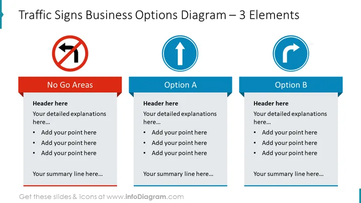
La diapositive est divisée en trois sections, chacune présentant un signal routier différent pour représenter un concept commercial. La première section "Zones à Éviter" indique les zones, stratégies ou pratiques à éviter. La deuxième section "Option A" suggère un chemin ou une stratégie potentielle à suivre, tandis que la troisième section "Option B" présente un itinéraire ou une méthode alternative. Chaque segment fournit de l'espace pour un titre, des explications détaillées, des points de balle pour ajouter des éléments spécifiques, et une ligne de résumé, permettant une comparaison ou analyse structurée des différentes options ou décisions commerciales.



