Your graphics add a nice touch to my presentations and I recently used them for one of my all-hands meetings. Your toolbox adds professionalism to my slides. Instead of using standard clipart.
Claude Jones, Director of Engineer, @Walmartlabs, USA
Your graphics add a nice touch to my presentations and I recently used them for one of my all-hands meetings. Your toolbox adds professionalism to my slides. Instead of using standard clipart.
Claude Jones, Director of Engineer, @Walmartlabs, USA
I needed a fresh look at some of my slides. I've tried to find a way to create a paintbrush effect, to underline, accentuate, add some color and the handwritten markers were just the things. Very easy to use, easy to size, change the color. It was an affordable, perfect solution and I'm happy to recommend it.
Anonymous, US
The crisp, clean look of the graphics, and the fact that it allowed me to easily edit and change the colors to match the template was my main reason for purchasing them.
Brandie Jenkins, E-learning Developer, USA
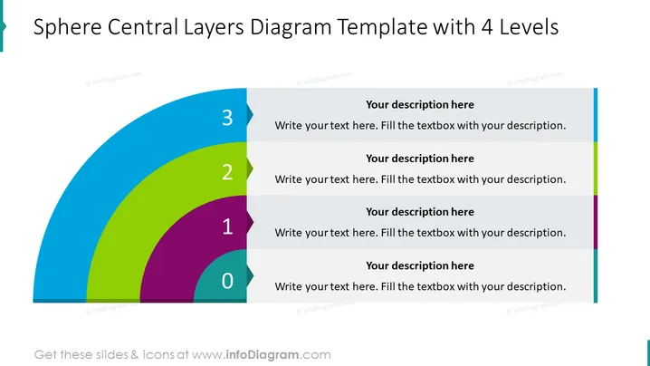
La diapositive est conçue pour représenter une approche en couches d'un concept ou d'une structure avec quatre niveaux distincts, étiquetés de 0 à 3. Chaque couche correspond à un niveau de détail ou de hiérarchie plus large et contient du texte de remplacement pour une description. Le niveau '0' pourrait représenter le cœur ou la fondation d'une idée, tandis que le niveau '3' pourrait représenter la couche la plus externe, indiquant peut-être un concept plus avancé ou moins central par rapport à la structure globale. Cette métaphore visuelle démontre efficacement comment différents éléments s'appuient les uns sur les autres au sein d'un système ou d'un processus.
La diapositive a un design propre et moderne avec un graphique audacieux qui attire efficacement l'attention sur la structure en couches. L'utilisation de couleurs distinctes pour chaque couche améliore la séparation visuelle et la hiérarchie.


