Your graphics add a nice touch to my presentations and I recently used them for one of my all-hands meetings. Your toolbox adds professionalism to my slides. Instead of using standard clipart.
Claude Jones, Director of Engineer, @Walmartlabs, USA
Your graphics add a nice touch to my presentations and I recently used them for one of my all-hands meetings. Your toolbox adds professionalism to my slides. Instead of using standard clipart.
Claude Jones, Director of Engineer, @Walmartlabs, USA
I needed a fresh look at some of my slides. I've tried to find a way to create a paintbrush effect, to underline, accentuate, add some color and the handwritten markers were just the things. Very easy to use, easy to size, change the color. It was an affordable, perfect solution and I'm happy to recommend it.
Anonymous, US
The crisp, clean look of the graphics, and the fact that it allowed me to easily edit and change the colors to match the template was my main reason for purchasing them.
Brandie Jenkins, E-learning Developer, USA
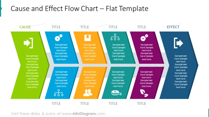
La diapositive est destinée à présenter une relation de cause à effet via un diagramme de flux. Il y a huit sections, chacune contenant un titre et un texte d'exemple - quatre de chaque côté impliquant une progression de "CAUSE" à "EFFET". Les titres et le texte sont des espaces réservés, suggérant que ces sections peuvent être personnalisées pour présenter des informations spécifiques concernant les facteurs menant à un résultat ou à une issue particulière. Chaque bloc représente une étape ou un facteur dans le processus et les flèches montrent la transition et la direction du flux.
La diapositive a un design très moderne et épuré avec des couleurs contrastées pour distinguer les zones de cause et d'effet. Ce design minimaliste à fort contraste est visuellement engageant et simplifie les processus complexes pour une compréhension plus facile.


