Your graphics add a nice touch to my presentations and I recently used them for one of my all-hands meetings. Your toolbox adds professionalism to my slides. Instead of using standard clipart.
Claude Jones, Director of Engineer, @Walmartlabs, USA
Your graphics add a nice touch to my presentations and I recently used them for one of my all-hands meetings. Your toolbox adds professionalism to my slides. Instead of using standard clipart.
Claude Jones, Director of Engineer, @Walmartlabs, USA
I needed a fresh look at some of my slides. I've tried to find a way to create a paintbrush effect, to underline, accentuate, add some color and the handwritten markers were just the things. Very easy to use, easy to size, change the color. It was an affordable, perfect solution and I'm happy to recommend it.
Anonymous, US
The crisp, clean look of the graphics, and the fact that it allowed me to easily edit and change the colors to match the template was my main reason for purchasing them.
Brandie Jenkins, E-learning Developer, USA
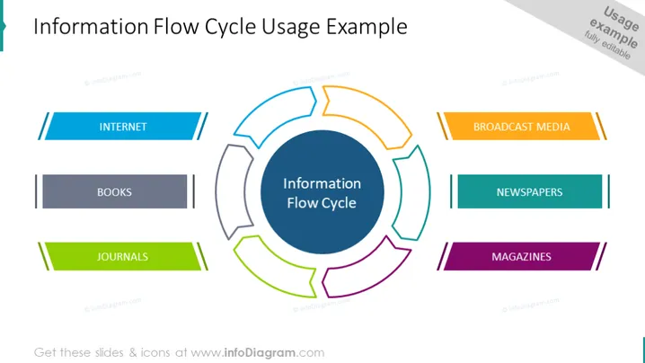
La diapositive PowerPoint décrit un concept appelé le "Cycle d'Information", représenté par un diagramme circulaire central entouré de segments étiquetés. Chaque segment représente une source d'information : Internet (souligné par deux lignes bleues), Livres (en gris foncé), Revues (en vert), Médias de diffusion (avec deux lignes orange), Journaux (en bleu-vert), et Magazines (en violet). L'Internet implique des sources en ligne, les Livres suggèrent la littérature traditionnelle, les Revues désignent des articles scientifiques, les Médias de diffusion signifient la télévision et la radio, les Journaux indiquent des nouvelles écrites quotidiennes, et les Magazines impliquent des publications périodiques.


