Your graphics add a nice touch to my presentations and I recently used them for one of my all-hands meetings. Your toolbox adds professionalism to my slides. Instead of using standard clipart.
Claude Jones, Director of Engineer, @Walmartlabs, USA
Your graphics add a nice touch to my presentations and I recently used them for one of my all-hands meetings. Your toolbox adds professionalism to my slides. Instead of using standard clipart.
Claude Jones, Director of Engineer, @Walmartlabs, USA
I needed a fresh look at some of my slides. I've tried to find a way to create a paintbrush effect, to underline, accentuate, add some color and the handwritten markers were just the things. Very easy to use, easy to size, change the color. It was an affordable, perfect solution and I'm happy to recommend it.
Anonymous, US
The crisp, clean look of the graphics, and the fact that it allowed me to easily edit and change the colors to match the template was my main reason for purchasing them.
Brandie Jenkins, E-learning Developer, USA
Malheureusement, il n'y a pas de titre de diapositive explicite présent dans l'image fournie.
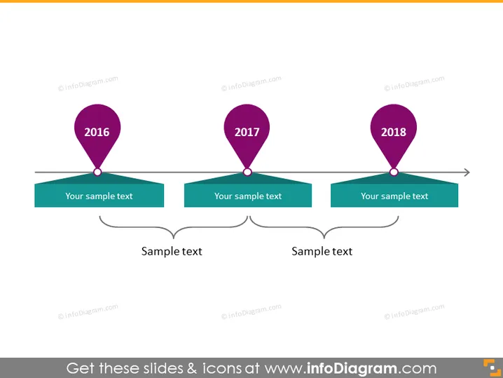
La diapositive PowerPoint représente une chronologie avec trois jalons pour les années 2016, 2017 et 2018. Chaque année est marquée par une icône de épingle de localisation spécifique, suggérant des événements ou des étapes significatifs. En dessous de chaque année, il y a une zone de texte pour ajouter des informations descriptives sur chaque jalon. Cela aide à expliquer la signification de chaque année sur la chronologie. De plus, il y a deux zones de texte interconnectées en bas, potentiellement pour résumer ou établir des liens entre les jalons.
La diapositive a une apparence propre et professionnelle, avec un style minimaliste qui évite le désordre. L'utilisation de couleurs vives pour les épingles et leur connexion à leurs boîtes de texte respectives rend la chronologie visuellement attrayante et facile à suivre.


