Your graphics add a nice touch to my presentations and I recently used them for one of my all-hands meetings. Your toolbox adds professionalism to my slides. Instead of using standard clipart.
Claude Jones, Director of Engineer, @Walmartlabs, USA
Your graphics add a nice touch to my presentations and I recently used them for one of my all-hands meetings. Your toolbox adds professionalism to my slides. Instead of using standard clipart.
Claude Jones, Director of Engineer, @Walmartlabs, USA
I needed a fresh look at some of my slides. I've tried to find a way to create a paintbrush effect, to underline, accentuate, add some color and the handwritten markers were just the things. Very easy to use, easy to size, change the color. It was an affordable, perfect solution and I'm happy to recommend it.
Anonymous, US
The crisp, clean look of the graphics, and the fact that it allowed me to easily edit and change the colors to match the template was my main reason for purchasing them.
Brandie Jenkins, E-learning Developer, USA
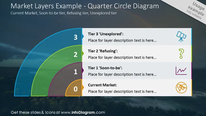
La diapositive PowerPoint intitulée "Exemples de couches de marché - Diagramme en quart de cercle" explique la stratification des catégories de marché avec des niveaux étiquetés de 0 à 3 : "Marché actuel", "Niveau 1 'Bientôt'", "Niveau 2 'Refusant'" et "Niveau 3 'Inexploré'." Chaque niveau dispose d'un espace réservé pour une description, indiquant où une explication détaillée peut être ajoutée. L'étiquetage numérique et les noms des niveaux suggèrent une progression du marché établi vers des segments inexplorés, chaque niveau représentant une étape spécifique dans le développement du marché ou la segmentation des clients.
L'aspect général de la diapositive est élégant et professionnel, avec un mélange d'éléments visuels qui améliorent la compréhension. Les couleurs vives utilisées pour chaque couche de marché créent une distinction claire et une hiérarchie, engageant visuellement et cognitivement le spectateur.


