Your graphics add a nice touch to my presentations and I recently used them for one of my all-hands meetings. Your toolbox adds professionalism to my slides. Instead of using standard clipart.
Claude Jones, Director of Engineer, @Walmartlabs, USA
Your graphics add a nice touch to my presentations and I recently used them for one of my all-hands meetings. Your toolbox adds professionalism to my slides. Instead of using standard clipart.
Claude Jones, Director of Engineer, @Walmartlabs, USA
I needed a fresh look at some of my slides. I've tried to find a way to create a paintbrush effect, to underline, accentuate, add some color and the handwritten markers were just the things. Very easy to use, easy to size, change the color. It was an affordable, perfect solution and I'm happy to recommend it.
Anonymous, US
The crisp, clean look of the graphics, and the fact that it allowed me to easily edit and change the colors to match the template was my main reason for purchasing them.
Brandie Jenkins, E-learning Developer, USA
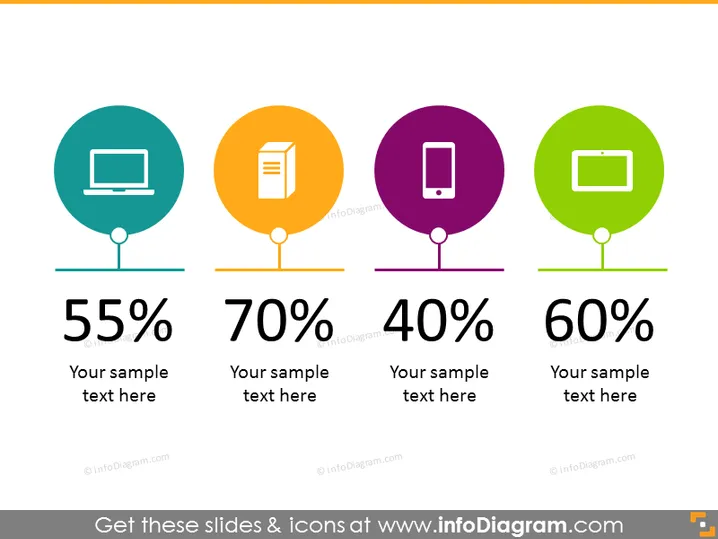
La diapositive PowerPoint présente une comparaison de quatre statistiques différentes, chacune associée à une icône graphique et un fond de cercle coloré. La première icône est un écran d'ordinateur à 55 %, suggérant une présence numérique ou une utilisation de la technologie. La deuxième est une icône de document à 70 %, représentant probablement le travail papier ou le traitement de l'information. La troisième est une icône de téléphone mobile à 40 %, indiquant un engagement mobile ou des télécommunications. Enfin, la quatrième est une icône de tablette à 60 %, ce qui pourrait désigner l'utilisation de tablettes ou la pénétration de l'informatique mobile. Chaque pourcentage est accompagné d'un espace réservé pour un texte explicatif supplémentaire.


