Your graphics add a nice touch to my presentations and I recently used them for one of my all-hands meetings. Your toolbox adds professionalism to my slides. Instead of using standard clipart.
Claude Jones, Director of Engineer, @Walmartlabs, USA
Your graphics add a nice touch to my presentations and I recently used them for one of my all-hands meetings. Your toolbox adds professionalism to my slides. Instead of using standard clipart.
Claude Jones, Director of Engineer, @Walmartlabs, USA
I needed a fresh look at some of my slides. I've tried to find a way to create a paintbrush effect, to underline, accentuate, add some color and the handwritten markers were just the things. Very easy to use, easy to size, change the color. It was an affordable, perfect solution and I'm happy to recommend it.
Anonymous, US
The crisp, clean look of the graphics, and the fact that it allowed me to easily edit and change the colors to match the template was my main reason for purchasing them.
Brandie Jenkins, E-learning Developer, USA
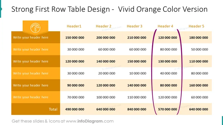
La diapositive présente un tableau conçu avec une forte emphase sur la première ligne qui se distingue par une couleur orange vif. Des espaces réservés génériques suggèrent la possibilité d'insérer des en-têtes spécifiques et des données financières. Chaque ligne semble représenter différentes catégories pour la saisie de données, tandis que la première colonne pourrait servir de descriptif pour chaque ligne. La dernière ligne du tableau indique un "Total" en gras, totalisant les valeurs numériques, indiquant un aperçu des calculs financiers ou des comparaisons entre différentes catégories ou périodes.
La diapositive affiche une apparence propre et professionnelle avec un schéma de couleurs audacieux qui met en évidence efficacement les informations clés. Le contraste entre les tons orange et beige, ainsi que l'accent violet, crée un intérêt visuel sans écraser le contenu.


