
Your graphics add a nice touch to my presentations and I recently used them for one of my all-hands meetings. Your toolbox adds professionalism to my slides. Instead of using standard clipart.
Claude Jones, Director of Engineer, @Walmartlabs, USA
Your graphics add a nice touch to my presentations and I recently used them for one of my all-hands meetings. Your toolbox adds professionalism to my slides. Instead of using standard clipart.
Claude Jones, Director of Engineer, @Walmartlabs, USA
I needed a fresh look at some of my slides. I've tried to find a way to create a paintbrush effect, to underline, accentuate, add some color and the handwritten markers were just the things. Very easy to use, easy to size, change the color. It was an affordable, perfect solution and I'm happy to recommend it.
Anonymous, US
The crisp, clean look of the graphics, and the fact that it allowed me to easily edit and change the colors to match the template was my main reason for purchasing them.
Brandie Jenkins, E-learning Developer, USA
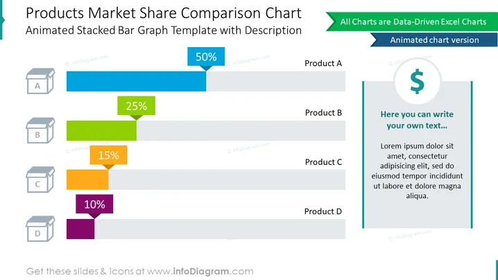
Utilisez ce diagramme créatif basé sur des données Excel pour comparer les résultats de parts de marché des produits sur des graphiques en barres. Cette diapositive contient un modèle de graphique à barres empilées animé illustré avec des visuels symbolisant des produits. Pour donner une image complète, utilisez le conteneur de texte sur le côté pour ajouter votre description.
Ce Diagramme de Comparaison de Parts de Marché des Produits fait partie de notre Modèle PPT de Graphiques Basés sur des Données de Graphiques en Barres et en Colonnes.




