
Your graphics add a nice touch to my presentations and I recently used them for one of my all-hands meetings. Your toolbox adds professionalism to my slides. Instead of using standard clipart.
Claude Jones, Director of Engineer, @Walmartlabs, USA
Your graphics add a nice touch to my presentations and I recently used them for one of my all-hands meetings. Your toolbox adds professionalism to my slides. Instead of using standard clipart.
Claude Jones, Director of Engineer, @Walmartlabs, USA
I needed a fresh look at some of my slides. I've tried to find a way to create a paintbrush effect, to underline, accentuate, add some color and the handwritten markers were just the things. Very easy to use, easy to size, change the color. It was an affordable, perfect solution and I'm happy to recommend it.
Anonymous, US
The crisp, clean look of the graphics, and the fact that it allowed me to easily edit and change the colors to match the template was my main reason for purchasing them.
Brandie Jenkins, E-learning Developer, USA
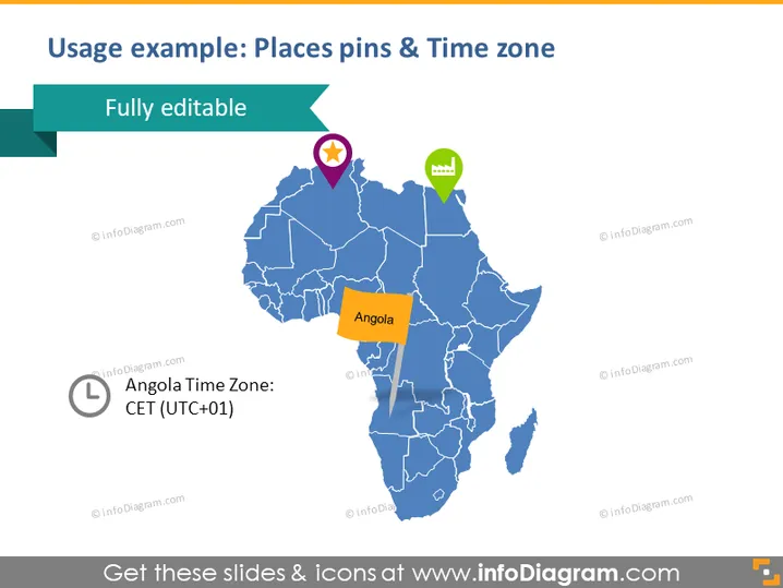
La diapositive présente comment les lieux géographiques et les fuseaux horaires peuvent être représentés visuellement à l'aide d'épingles sur une carte. Elle inclut une carte de l'Afrique avec des pays mis en évidence et un accent particulier sur l'Angola, qui est marqué par une épingle et étiqueté. À côté de l'Angola, il y a une note indiquant que le pays se trouve dans le fuseau horaire de l'Europe centrale (UTC+01).
La diapositive présente un design propre et professionnel, avec un bon contraste entre la carte et les éléments infographiques. L'utilisation de différentes couleurs pour les épingles et les notes aide à attirer l'attention sur des informations spécifiques sur la carte.




