Your graphics add a nice touch to my presentations and I recently used them for one of my all-hands meetings. Your toolbox adds professionalism to my slides. Instead of using standard clipart.
Claude Jones, Director of Engineer, @Walmartlabs, USA
Your graphics add a nice touch to my presentations and I recently used them for one of my all-hands meetings. Your toolbox adds professionalism to my slides. Instead of using standard clipart.
Claude Jones, Director of Engineer, @Walmartlabs, USA
I needed a fresh look at some of my slides. I've tried to find a way to create a paintbrush effect, to underline, accentuate, add some color and the handwritten markers were just the things. Very easy to use, easy to size, change the color. It was an affordable, perfect solution and I'm happy to recommend it.
Anonymous, US
The crisp, clean look of the graphics, and the fact that it allowed me to easily edit and change the colors to match the template was my main reason for purchasing them.
Brandie Jenkins, E-learning Developer, USA
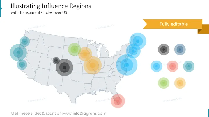
La diapositive PowerPoint présente un concept intitulé "Illustrer les Régions d'Influence avec des Cercles Transparents sur les États-Unis", décrivant divers degrés d'influence à travers différentes régions des États-Unis à travers une série de cercles transparents qui se chevauchent. Les tailles variées des cercles représentent probablement les différentes magnitudes ou intensités d'influence, les cercles plus grands désignant une influence plus significative et les cercles plus petits indiquant une influence moindre. Chaque groupe de cercles peut correspondre à un sujet ou à un indicateur spécifique, communiquant comment l'influence se propage géographiquement.


