Your graphics add a nice touch to my presentations and I recently used them for one of my all-hands meetings. Your toolbox adds professionalism to my slides. Instead of using standard clipart.
Claude Jones, Director of Engineer, @Walmartlabs, USA
Your graphics add a nice touch to my presentations and I recently used them for one of my all-hands meetings. Your toolbox adds professionalism to my slides. Instead of using standard clipart.
Claude Jones, Director of Engineer, @Walmartlabs, USA
I needed a fresh look at some of my slides. I've tried to find a way to create a paintbrush effect, to underline, accentuate, add some color and the handwritten markers were just the things. Very easy to use, easy to size, change the color. It was an affordable, perfect solution and I'm happy to recommend it.
Anonymous, US
The crisp, clean look of the graphics, and the fact that it allowed me to easily edit and change the colors to match the template was my main reason for purchasing them.
Brandie Jenkins, E-learning Developer, USA
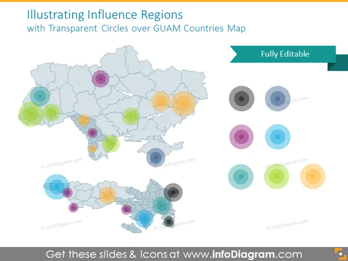
La diapositive PowerPoint présente le concept de "Illustration des Régions d'Influence" en utilisant des cercles colorés transparents placés sur une carte représentant les pays de GUAM. Chaque cercle transparent représente probablement une région d'influence différente, avec des tailles variables pour illustrer éventuellement l'étendue ou l'intensité de cette influence. La représentation visuelle aide à comprendre comment différentes zones peuvent être affectées ou avoir une certaine dominance ou impact.
La diapositive a un aspect épuré et moderne, avec un accent sur la représentation visuelle des données. L'utilisation de la transparence dans les cercles permet de rendre visible la carte sous-jacente, ce qui communique efficacement l'idée d'influence régionale sans obscurcir les détails géographiques.


