

Your graphics add a nice touch to my presentations and I recently used them for one of my all-hands meetings. Your toolbox adds professionalism to my slides. Instead of using standard clipart.
Claude Jones, Director of Engineer, @Walmartlabs, USA

Your graphics add a nice touch to my presentations and I recently used them for one of my all-hands meetings. Your toolbox adds professionalism to my slides. Instead of using standard clipart.
Claude Jones, Director of Engineer, @Walmartlabs, USA
I needed a fresh look at some of my slides. I've tried to find a way to create a paintbrush effect, to underline, accentuate, add some color and the handwritten markers were just the things. Very easy to use, easy to size, change the color. It was an affordable, perfect solution and I'm happy to recommend it.
Anonymous, US
The crisp, clean look of the graphics, and the fact that it allowed me to easily edit and change the colors to match the template was my main reason for purchasing them.
Brandie Jenkins, E-learning Developer, USA
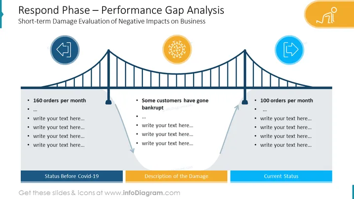
La diapositive est intitulée "Phase de Réponse – Analyse de l'Écart de Performance" avec un sous-titre "Évaluation à Court Terme des Impacts Négatifs sur l'Entreprise." Elle présente une métaphore visuelle d'un pont indiquant un écart de performance, avec trois étapes : "État Avant Covid-19," "Description des Dommages," et "État Actuel." Le pont montre une tendance à la baisse en allant de la gauche vers le centre, et une tendance à la hausse vers la droite, suggérant une reprise. La première étape liste "160 commandes par mois," tandis que l'étape intermédiaire note "Certains clients ont fait faillite," et la dernière étape montre "100 commandes par mois." Chaque étape a des points supplémentaires pour du texte personnalisable.
La diapositive utilise un design simple mais efficace, utilisant des icônes et un codage couleur pour illustrer le passé, l'impact, et l'état actuel d'une entreprise. La métaphore du pont transmet efficacement l'idée de franchir un écart de performance.



