

Your graphics add a nice touch to my presentations and I recently used them for one of my all-hands meetings. Your toolbox adds professionalism to my slides. Instead of using standard clipart.
Claude Jones, Director of Engineer, @Walmartlabs, USA

Your graphics add a nice touch to my presentations and I recently used them for one of my all-hands meetings. Your toolbox adds professionalism to my slides. Instead of using standard clipart.
Claude Jones, Director of Engineer, @Walmartlabs, USA
I needed a fresh look at some of my slides. I've tried to find a way to create a paintbrush effect, to underline, accentuate, add some color and the handwritten markers were just the things. Very easy to use, easy to size, change the color. It was an affordable, perfect solution and I'm happy to recommend it.
Anonymous, US
The crisp, clean look of the graphics, and the fact that it allowed me to easily edit and change the colors to match the template was my main reason for purchasing them.
Brandie Jenkins, E-learning Developer, USA
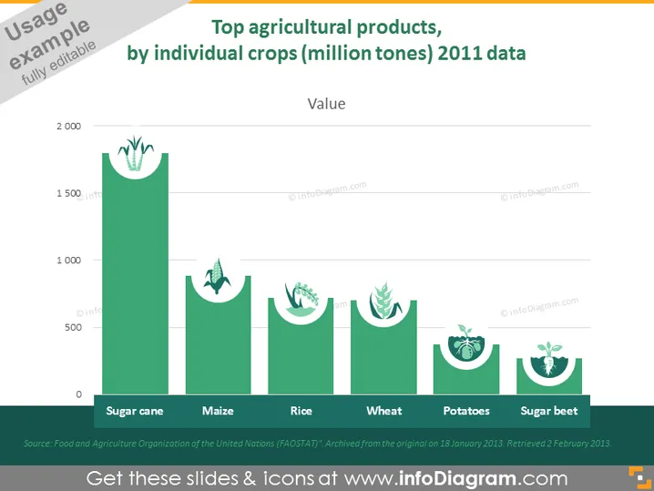
Die Folie präsentiert Daten über die Verwendung der wichtigsten Agrarprodukte, gemessen in Millionen Tonnen für das Jahr 2011. Sie skizziert fünf verschiedene Kulturen: Zuckerrohr, Mais, Reis, Weizen, Kartoffeln und Zuckerrüben, die jeweils mit einer entsprechenden Balkenhöhe dargestellt sind, die die Menge angibt. Zuckerrohr zeigt die höchste Verwendung, gefolgt von Mais, Reis, Weizen, Kartoffeln und Zuckerrüben in absteigender Reihenfolge der produzierten Menge. Die Quelle der Daten wird als Ernährungs- und Landwirtschaftsorganisation der Vereinten Nationen (FAOSTAT) angegeben.
Die Folie hat ein sauberes und modernes Erscheinungsbild, mit einem Farbschema, das umweltfreundliche Landwirtschaft betont. Der Einsatz von Symbolen und Datenvisualisierung macht die Informationen verdaulich und visuell ansprechend.



