

Your graphics add a nice touch to my presentations and I recently used them for one of my all-hands meetings. Your toolbox adds professionalism to my slides. Instead of using standard clipart.
Claude Jones, Director of Engineer, @Walmartlabs, USA

Your graphics add a nice touch to my presentations and I recently used them for one of my all-hands meetings. Your toolbox adds professionalism to my slides. Instead of using standard clipart.
Claude Jones, Director of Engineer, @Walmartlabs, USA
I needed a fresh look at some of my slides. I've tried to find a way to create a paintbrush effect, to underline, accentuate, add some color and the handwritten markers were just the things. Very easy to use, easy to size, change the color. It was an affordable, perfect solution and I'm happy to recommend it.
Anonymous, US
The crisp, clean look of the graphics, and the fact that it allowed me to easily edit and change the colors to match the template was my main reason for purchasing them.
Brandie Jenkins, E-learning Developer, USA
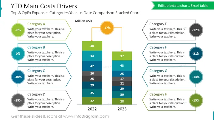
Die Folie präsentiert das "Top 8 OpEx Ausgabenkategorien Jahr-zu-Datum Vergleich Gestapelte Grafik", die acht Kategorien (A bis H) mit entsprechenden prozentualen Änderungen und Platz für Beschreibungen visualisiert. Jede Kategorie zeigt eine Veränderung der Betriebskosten, wie Kategorie A mit einer Verringerung von 8%, Kategorie B ohne Änderung und Kategorie C mit einer signifikanten Reduzierung von 40%. Das gestapelte Balkendiagramm in der Mitte vergleicht die Kosten über zwei Jahre, 2022 und 2023, und hebt eine Abnahme mit einem orangefarbenen Pfeil und Prozentwert hervor.
Die Folie weist ein ausgewogenes und farbenfrohes Design auf, mit einem zentralen Fokus auf dem gestapelten Balkendiagramm, flankiert von Kategoriebeschreibungen. Die Verwendung von Farbkodierung hilft dabei, die Textfelder mit den entsprechenden Daten im Diagramm zu verbinden.



