

Your graphics add a nice touch to my presentations and I recently used them for one of my all-hands meetings. Your toolbox adds professionalism to my slides. Instead of using standard clipart.
Claude Jones, Director of Engineer, @Walmartlabs, USA

Your graphics add a nice touch to my presentations and I recently used them for one of my all-hands meetings. Your toolbox adds professionalism to my slides. Instead of using standard clipart.
Claude Jones, Director of Engineer, @Walmartlabs, USA
I needed a fresh look at some of my slides. I've tried to find a way to create a paintbrush effect, to underline, accentuate, add some color and the handwritten markers were just the things. Very easy to use, easy to size, change the color. It was an affordable, perfect solution and I'm happy to recommend it.
Anonymous, US
The crisp, clean look of the graphics, and the fact that it allowed me to easily edit and change the colors to match the template was my main reason for purchasing them.
Brandie Jenkins, E-learning Developer, USA
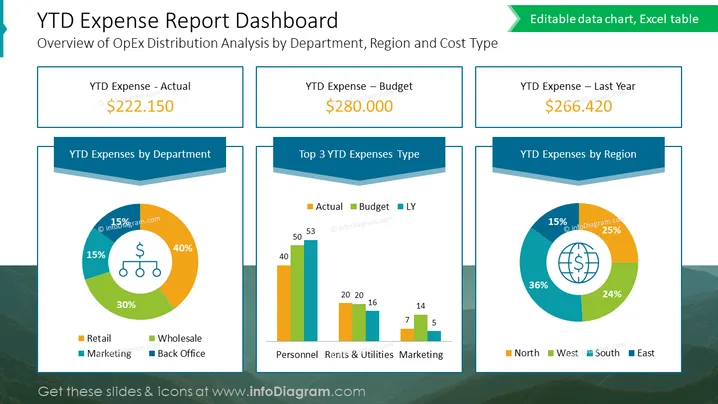
Die Folie präsentiert ein "YTD Ausgabenbericht-Dashboard" mit einer Übersicht der operativen Ausgabenverteilung, die nach Abteilung, Region und Kostenart analysiert ist. Es enthält drei wichtige finanzielle Kennzahlen: "YTD Ausgaben - Ist," "YTD Ausgaben - Budget," und "YTD Ausgaben - Vorjahr," mit entsprechenden Zahlen, die eine finanzielle Bewertung oder Vergleichsszenario vorschlagen. Darüber hinaus gibt es drei Tortendiagramme, die "YTD Ausgaben nach Abteilung," "Top 3 YTD Ausgabenarten" und "YTD Ausgaben nach Region" darstellen, die jeweils einen visuellen Überblick über die Ausgaben bieten.
Der Gesamteindruck der Folie ist sauber und unternehmerisch, mit einem strukturierten Layout, das Informationen für eine schnelle und effiziente Datenaufnahme compartmentalisiert. Der Einsatz von Farben und Formen ist durchdacht gestaltet, um verschiedene Datensätze zu unterscheiden und gleichzeitig ein kohärentes Design zu wahren.



