Your graphics add a nice touch to my presentations and I recently used them for one of my all-hands meetings. Your toolbox adds professionalism to my slides. Instead of using standard clipart.
Claude Jones, Director of Engineer, @Walmartlabs, USA
Your graphics add a nice touch to my presentations and I recently used them for one of my all-hands meetings. Your toolbox adds professionalism to my slides. Instead of using standard clipart.
Claude Jones, Director of Engineer, @Walmartlabs, USA
I needed a fresh look at some of my slides. I've tried to find a way to create a paintbrush effect, to underline, accentuate, add some color and the handwritten markers were just the things. Very easy to use, easy to size, change the color. It was an affordable, perfect solution and I'm happy to recommend it.
Anonymous, US
The crisp, clean look of the graphics, and the fact that it allowed me to easily edit and change the colors to match the template was my main reason for purchasing them.
Brandie Jenkins, E-learning Developer, USA
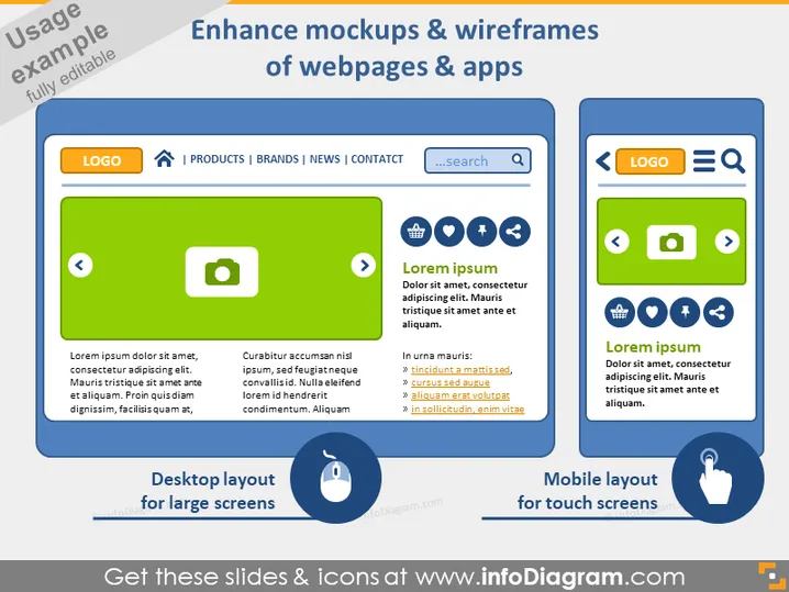
Diese Folie ist darauf ausgelegt, die Verbesserung von Mockups und Wireframes für Webseiten und Apps zu demonstrieren, indem Desktop- und mobile Layouts präsentiert werden. Sie betont die Anpassungsfähigkeit von Designs an unterschiedliche Bildschirmgrößen. Die Folie zeigt zwei Vergleiche zwischen Layouts: "Desktop-Layout für große Bildschirme" zeigt eine konzeptionelle Webschnittstelle mit Elementen wie einer Suchleiste und Navigation, während "Mobile Layout für Touchscreens" eine vereinfachte Version der Schnittstelle für mobile Geräte präsentiert, wobei größere Symbole und touchscreenfreundliche Elemente hervorgehoben werden.
Die PowerPoint-Folie ist darauf ausgelegt zu zeigen, wie Mockups und Wireframes für Webseiten und Apps für unterschiedliche Bildschirmgrößen optimiert werden können. Sie vergleicht "Desktop-Layout für große Bildschirme" mit einer detaillierten Schnittstelle, die Navigation und Suche umfasst, gegenüber "Mobile Layout für Touchscreens", das Elemente zur Benutzerfreundlichkeit vereinfacht. Das Desktop-Beispiel enthält Platzhalterüberschriften und eine grüne Hervorhebung, während das mobile Pendant ein thumbfreundliches Design mit einer blauen Hervorhebung betont. Beide Abschnitte präsentieren Konzepte, die im Design von Benutzeroberflächen wichtig sind: große, interaktive Schaltflächen und Symbole für das mobile Layout und eine umfassendere Navigation für Desktops.