Your graphics add a nice touch to my presentations and I recently used them for one of my all-hands meetings. Your toolbox adds professionalism to my slides. Instead of using standard clipart.
Claude Jones, Director of Engineer, @Walmartlabs, USA
Your graphics add a nice touch to my presentations and I recently used them for one of my all-hands meetings. Your toolbox adds professionalism to my slides. Instead of using standard clipart.
Claude Jones, Director of Engineer, @Walmartlabs, USA
I needed a fresh look at some of my slides. I've tried to find a way to create a paintbrush effect, to underline, accentuate, add some color and the handwritten markers were just the things. Very easy to use, easy to size, change the color. It was an affordable, perfect solution and I'm happy to recommend it.
Anonymous, US
The crisp, clean look of the graphics, and the fact that it allowed me to easily edit and change the colors to match the template was my main reason for purchasing them.
Brandie Jenkins, E-learning Developer, USA
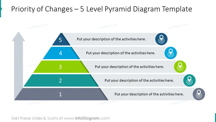
##Folieninhalt: Diese Folie zeigt ein Wertschöpfungsketten-Pyramiden-Diagramm mit 5 Ebenen. Die Ebenen repräsentieren die Priorität der Änderungen in der Analyse der Wertschöpfungskette. Erklären Sie, welche vorgeschlagenen Änderungen vorgenommen werden sollen, um den Wert Ihrer Arbeit zu steigern. Bearbeiten Sie das Diagramm entsprechend Ihren Bedürfnissen, ohne an Qualität zu verlieren, und wenn Sie nicht wissen, wie, finden Sie Videoanleitungen. Sie können die Präsentation in anderer Software herunterladen, wie z.B. Google Slides und Keynote. Klicken Sie auf das Bild, um die gesamte PowerPoint-Vorlage zur Wertschöpfungsanalyse zu sehen. ##Foliendeskription der Infografik: Pyramiden-Diagramm, Flache Umriss-Icons, Ziel-Icon, Pfeil Vektor, Aufzählungsliste


