Your graphics add a nice touch to my presentations and I recently used them for one of my all-hands meetings. Your toolbox adds professionalism to my slides. Instead of using standard clipart.
Claude Jones, Director of Engineer, @Walmartlabs, USA
Your graphics add a nice touch to my presentations and I recently used them for one of my all-hands meetings. Your toolbox adds professionalism to my slides. Instead of using standard clipart.
Claude Jones, Director of Engineer, @Walmartlabs, USA
I needed a fresh look at some of my slides. I've tried to find a way to create a paintbrush effect, to underline, accentuate, add some color and the handwritten markers were just the things. Very easy to use, easy to size, change the color. It was an affordable, perfect solution and I'm happy to recommend it.
Anonymous, US
The crisp, clean look of the graphics, and the fact that it allowed me to easily edit and change the colors to match the template was my main reason for purchasing them.
Brandie Jenkins, E-learning Developer, USA
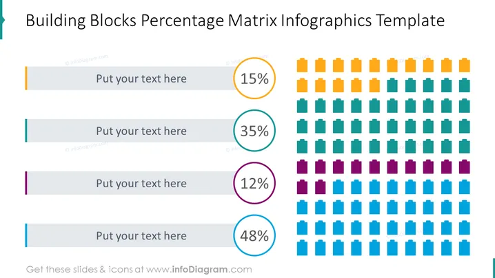
Die Folie präsentiert einen visuellen Vergleich verschiedener Mengen durch eine Blockmatrix, die Prozentsätze darstellt. Jede Zeile ist mit einem Textplatzhalter und einem kreisförmigen Prozentlabel verbunden, das von 15%, 35%, 12% bis 48% reicht. Diese Zahlen deuten darauf hin, dass die Folie verschiedene Komponenten eines Ganzen, Segmente eines Marktes oder vielleicht Antworten in einer Umfrage darstellen könnte, wobei jede farbcodierte Zeile eine bestimmte Kategorie kennzeichnet, die zu einer Gesamtsumme beiträgt.
Die Folie hat ein professionelles und sauberes Design, mit einer harmonischen Farbpalette und starker visueller Kohärenz. Die Blockmatrix bietet einen klaren quantitativen Vergleich, während die Farbcodeung hilft, den Text mit den entsprechenden Daten zu assoziieren.


