

Your graphics add a nice touch to my presentations and I recently used them for one of my all-hands meetings. Your toolbox adds professionalism to my slides. Instead of using standard clipart.
Claude Jones, Director of Engineer, @Walmartlabs, USA

Your graphics add a nice touch to my presentations and I recently used them for one of my all-hands meetings. Your toolbox adds professionalism to my slides. Instead of using standard clipart.
Claude Jones, Director of Engineer, @Walmartlabs, USA
I needed a fresh look at some of my slides. I've tried to find a way to create a paintbrush effect, to underline, accentuate, add some color and the handwritten markers were just the things. Very easy to use, easy to size, change the color. It was an affordable, perfect solution and I'm happy to recommend it.
Anonymous, US
The crisp, clean look of the graphics, and the fact that it allowed me to easily edit and change the colors to match the template was my main reason for purchasing them.
Brandie Jenkins, E-learning Developer, USA
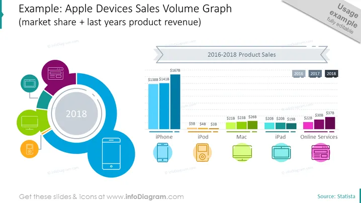
Die Folie präsentiert ein Verkaufsvolumen-Diagramm für Apple-Produkte über einen Zeitraum von drei Jahren (2016-2018), das sich auf fünf Produktkategorien konzentriert: iPhone, iPod, Mac, iPad und Online-Dienste. Umsatzfiguren in Milliarden Dollar werden für jedes Produkt in den jeweiligen Jahren aufgelistet, wobei die iPhone-Verkäufe am höchsten sind. Das Balkendiagramm für jedes Produkt zeigt ein Wachstum oder einen Rückgang im Laufe der Jahre, wobei das iPhone ein hohes Verkaufsvolumen aufweist, während die iPod-Verkäufe deutlich niedriger sind.
Die Folie hat ein sauberes und modernes grafisches Erscheinungsbild, das eine Mischung aus lebhaften Registerfarben und einfacheren Grautönen für das Diagramm nutzt. Der große zentrale Kreis und die umgebenden Produktikonen bieten einen Fokuspunkt, der das Diagramm auf der rechten Seite der Folie ausbalanciert.



