Your graphics add a nice touch to my presentations and I recently used them for one of my all-hands meetings. Your toolbox adds professionalism to my slides. Instead of using standard clipart.
Claude Jones, Director of Engineer, @Walmartlabs, USA
Your graphics add a nice touch to my presentations and I recently used them for one of my all-hands meetings. Your toolbox adds professionalism to my slides. Instead of using standard clipart.
Claude Jones, Director of Engineer, @Walmartlabs, USA
I needed a fresh look at some of my slides. I've tried to find a way to create a paintbrush effect, to underline, accentuate, add some color and the handwritten markers were just the things. Very easy to use, easy to size, change the color. It was an affordable, perfect solution and I'm happy to recommend it.
Anonymous, US
The crisp, clean look of the graphics, and the fact that it allowed me to easily edit and change the colors to match the template was my main reason for purchasing them.
Brandie Jenkins, E-learning Developer, USA
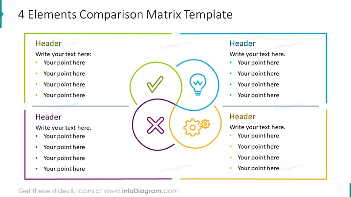
Die Folie zeigt eine Vorlage zum Vergleichen von vier Elementen. Jedes Quadrat steht für eine Kategorie oder ein Kriterium zum Vergleich, symbolisiert durch ein Icon: ein Häkchen, eine Glühbirne, ein Zahnrad und ein 'X'-Symbol. Diese Icons könnten Konzepte wie Erfolg, Ideen/Innovation, Prozesse/Systeme und Herausforderungen/Negatives illustrieren. Neben jeder Grafik befindet sich ein Textfeld mit einem Platzhalter "Überschrift", das den Titel der Kategorie vorschlägt, und vier Aufzählungspunkte, um spezifische Informationen oder Erkenntnisse zu jeder Kategorie aufzulisten.
Die Folie hat ein sauberes und professionelles Design mit einem guten Einsatz von Weißraum, um Überfüllung zu verhindern. Der Einsatz von Farben hilft, die vier Konzepte zu unterscheiden und lässt die grafischen Elemente hervorstechen.


