

Your graphics add a nice touch to my presentations and I recently used them for one of my all-hands meetings. Your toolbox adds professionalism to my slides. Instead of using standard clipart.
Claude Jones, Director of Engineer, @Walmartlabs, USA

Your graphics add a nice touch to my presentations and I recently used them for one of my all-hands meetings. Your toolbox adds professionalism to my slides. Instead of using standard clipart.
Claude Jones, Director of Engineer, @Walmartlabs, USA
I needed a fresh look at some of my slides. I've tried to find a way to create a paintbrush effect, to underline, accentuate, add some color and the handwritten markers were just the things. Very easy to use, easy to size, change the color. It was an affordable, perfect solution and I'm happy to recommend it.
Anonymous, US
The crisp, clean look of the graphics, and the fact that it allowed me to easily edit and change the colors to match the template was my main reason for purchasing them.
Brandie Jenkins, E-learning Developer, USA
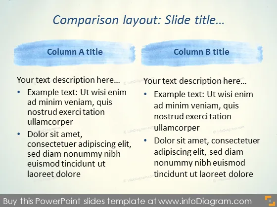
Die Folie präsentiert ein Vergleichs-layout zwischen zwei Spalten mit den Bezeichnungen 'Spalte A Titel' und 'Spalte B Titel.' Jede Spalte enthält eine Platzhaltertextbeschreibung, gefolgt von Aufzählungspunkten, die verschiedene Konzepte erklären. Zum Beispiel erläutern in Spalte A die Aufzählungspunkte 'Ut wisi enim ad minim veniam,' was auf einen Beispieltext hinweist, und 'Dolor sit amet, consectetuer adipiscing elit,' das sich auf einen Standardplatzhalter oder Aspekte eines Themas beziehen könnte, das im Detail besprochen werden soll. Spalte B spiegelt diese Struktur mit identischem Platzhaltertext und Aufzählungspunkten wider, wobei der Vergleichsaspekt des Zwecks der Folie betont wird.
Die Folie verwendet ein minimalistisches Design mit einem Aquarellmotiv für visuelles Interesse. Die blauen Pinselstriche fügen einen Farbtupfer hinzu und grenzen die verschiedenen Abschnitte ab, während das Gesamtlayout klar und auf den Inhalt fokussiert bleibt.



