
Your graphics add a nice touch to my presentations and I recently used them for one of my all-hands meetings. Your toolbox adds professionalism to my slides. Instead of using standard clipart.
Claude Jones, Director of Engineer, @Walmartlabs, USA
Your graphics add a nice touch to my presentations and I recently used them for one of my all-hands meetings. Your toolbox adds professionalism to my slides. Instead of using standard clipart.
Claude Jones, Director of Engineer, @Walmartlabs, USA
I needed a fresh look at some of my slides. I've tried to find a way to create a paintbrush effect, to underline, accentuate, add some color and the handwritten markers were just the things. Very easy to use, easy to size, change the color. It was an affordable, perfect solution and I'm happy to recommend it.
Anonymous, US
The crisp, clean look of the graphics, and the fact that it allowed me to easily edit and change the colors to match the template was my main reason for purchasing them.
Brandie Jenkins, E-learning Developer, USA
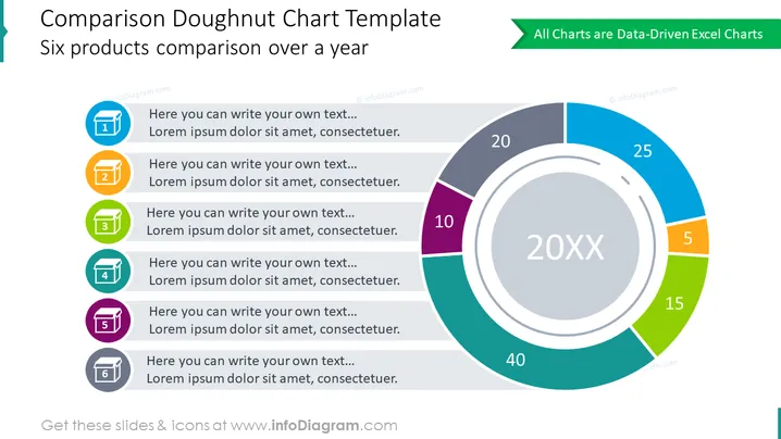
Die Folie bietet einen visuellen und textlichen Vergleich von sechs Produkten über ein Jahr hinweg, dargestellt im Format eines Donut-Diagramms. Jedes Segment des Donut-Diagramms entspricht einem anderen Produkt, das visuell mit unterschiedlichen Farben und numerischen Werten dargestellt wird, die Leistungskennzahlen oder Mengen anzeigen. Zu jedem farbigen Segment gehört eine nummerierte Liste (von 1 bis 6) mit Platz für benutzerdefinierten Text, in der Details oder Beschreibungen jedes Produkts oder Datenkategorie hinzugefügt werden können, um die Diagrammdaten zu ergänzen.
Die Folie hat ein sauberes, modernes Erscheinungsbild mit einer überwiegend blauen und grauen Farbpalette, die mit lebendigen Farben für jedes Diagrammsegment akzentuiert ist. Das Design ist minimalistisch und legt den Fokus auf Klarheit und Lesbarkeit.




