

Your graphics add a nice touch to my presentations and I recently used them for one of my all-hands meetings. Your toolbox adds professionalism to my slides. Instead of using standard clipart.
Claude Jones, Director of Engineer, @Walmartlabs, USA

Your graphics add a nice touch to my presentations and I recently used them for one of my all-hands meetings. Your toolbox adds professionalism to my slides. Instead of using standard clipart.
Claude Jones, Director of Engineer, @Walmartlabs, USA
I needed a fresh look at some of my slides. I've tried to find a way to create a paintbrush effect, to underline, accentuate, add some color and the handwritten markers were just the things. Very easy to use, easy to size, change the color. It was an affordable, perfect solution and I'm happy to recommend it.
Anonymous, US
The crisp, clean look of the graphics, and the fact that it allowed me to easily edit and change the colors to match the template was my main reason for purchasing them.
Brandie Jenkins, E-learning Developer, USA
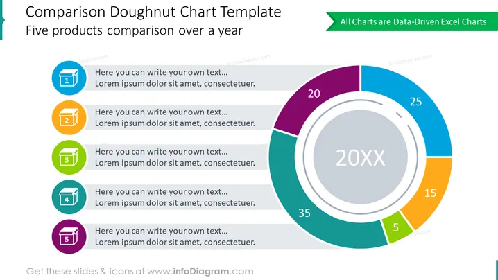
Die Folie präsentiert ein Vergleichsanalysetool mit dem Titel "Vergleich Donut Diagramm Vorlage", das sich auf den Vergleich von fünf Produkten über ein Jahr konzentriert. Das Diagramm zeigt prozentuale Verteilungen für jedes Produkt und zeigt deren Anteil am Ganzen. Begleitend zum Diagramm gibt es fünf nummerierte farbige Abschnitte, die wahrscheinlich Datenpunkte oder Kategorien für jedes Produkt darstellen. Jeder Abschnitt enthält einen Platzhaltertext, der vorschlägt, wo zusätzliche Informationen ausgefüllt werden könnten.
Die Folie ist professionell gestaltet, mit einer modernen und funktionalen Ästhetik, die visuelles Interesse und Klarheit der Informationen in Einklang bringt. Die Farbauswahl ist ansprechend und hilft, die Datenpunkte zu unterscheiden.



