
Your graphics add a nice touch to my presentations and I recently used them for one of my all-hands meetings. Your toolbox adds professionalism to my slides. Instead of using standard clipart.
Claude Jones, Director of Engineer, @Walmartlabs, USA
Your graphics add a nice touch to my presentations and I recently used them for one of my all-hands meetings. Your toolbox adds professionalism to my slides. Instead of using standard clipart.
Claude Jones, Director of Engineer, @Walmartlabs, USA
I needed a fresh look at some of my slides. I've tried to find a way to create a paintbrush effect, to underline, accentuate, add some color and the handwritten markers were just the things. Very easy to use, easy to size, change the color. It was an affordable, perfect solution and I'm happy to recommend it.
Anonymous, US
The crisp, clean look of the graphics, and the fact that it allowed me to easily edit and change the colors to match the template was my main reason for purchasing them.
Brandie Jenkins, E-learning Developer, USA
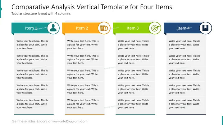
Die Folie ist so strukturiert, dass sie eine Vergleichsanalyse von vier verschiedenen Elementen erleichtert, die jeweils in einer eigenen Spalte mit Platz für detaillierte Beschreibungen dargestellt sind. "Element 1" zeigt ein Personen-Symbol, das auf den Fokus auf Einzelpersonen oder Humanressourcen hinweist. "Element 2" enthält ein Finanzsymbol, das möglicherweise finanzielle Aspekte oder wirtschaftliche Kennzahlen repräsentiert. "Element 3" zeigt ein Zahnrad-Symbol, das sich auf Prozesse oder Operationen beziehen könnte. "Element 4" ist mit einem Computerbildschirm gekennzeichnet, was auf Technologie oder digitale Themen hinweist. Jede Spalte bietet mehrere Text-Platzhalter, die dem Präsentierenden ermöglichen, diese Konzepte weiter auszuführen.
Die Folie ist sauber organisiert mit einem klaren Layout in vier Spalten und verwendet eine Farbcode, um jede Kategorie visuell zu unterscheiden. Die einfachen Icons vermitteln die allgemeinen Themen, ohne zu komplex oder ablenkend zu sein.




