Your graphics add a nice touch to my presentations and I recently used them for one of my all-hands meetings. Your toolbox adds professionalism to my slides. Instead of using standard clipart.
Claude Jones, Director of Engineer, @Walmartlabs, USA
Your graphics add a nice touch to my presentations and I recently used them for one of my all-hands meetings. Your toolbox adds professionalism to my slides. Instead of using standard clipart.
Claude Jones, Director of Engineer, @Walmartlabs, USA
I needed a fresh look at some of my slides. I've tried to find a way to create a paintbrush effect, to underline, accentuate, add some color and the handwritten markers were just the things. Very easy to use, easy to size, change the color. It was an affordable, perfect solution and I'm happy to recommend it.
Anonymous, US
The crisp, clean look of the graphics, and the fact that it allowed me to easily edit and change the colors to match the template was my main reason for purchasing them.
Brandie Jenkins, E-learning Developer, USA
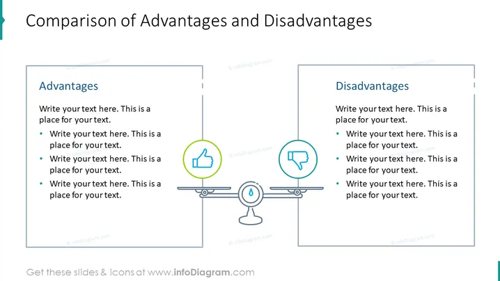
Die Folie präsentiert einen ausgewogenen Vergleich von zwei Aspekten, die als "Vorteile" und "Nachteile" bezeichnet werden. Jeder Abschnitt enthält Platzhaltertexte, die vorschlagen, wo relevante Inhalte eingegeben werden können. Der Abschnitt über die Vorteile fordert dazu auf, Punkte aufzulisten, die wahrscheinlich positive Merkmale oder Stärken darstellen. Ebenso soll der Abschnitt über die Nachteile die negativen oder weniger günstigen Faktoren umreißen. Diese Struktur ist nützlich, um eine differenzierte Sichtweise zu präsentieren, die sowohl die positiven als auch die negativen Eigenschaften eines Themas, einer Idee oder einer Entscheidung hervorhebt.
Das Gesamtbild der Folie ist professionell und symmetrisch, was ein Gleichgewicht im visuellen Gewicht widerspiegelt. Der Einsatz von Icons und Farbcodierung unterscheidet effektiv die Vorteile von den Nachteilen.


