Your graphics add a nice touch to my presentations and I recently used them for one of my all-hands meetings. Your toolbox adds professionalism to my slides. Instead of using standard clipart.
Claude Jones, Director of Engineer, @Walmartlabs, USA
Your graphics add a nice touch to my presentations and I recently used them for one of my all-hands meetings. Your toolbox adds professionalism to my slides. Instead of using standard clipart.
Claude Jones, Director of Engineer, @Walmartlabs, USA
I needed a fresh look at some of my slides. I've tried to find a way to create a paintbrush effect, to underline, accentuate, add some color and the handwritten markers were just the things. Very easy to use, easy to size, change the color. It was an affordable, perfect solution and I'm happy to recommend it.
Anonymous, US
The crisp, clean look of the graphics, and the fact that it allowed me to easily edit and change the colors to match the template was my main reason for purchasing them.
Brandie Jenkins, E-learning Developer, USA
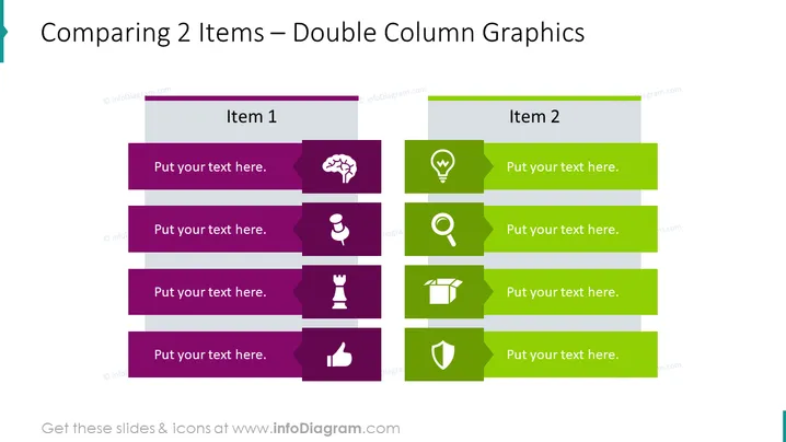
Die PowerPoint-Folie mit dem Titel "Vergleich von 2 Elementen – Doppelte Spaltengrafiken" veranschaulicht einen Vergleich zwischen zwei verschiedenen Elementen oder Konzepten. Jede Spalte ist einem Element gewidmet, und beide Spalten enthalten vier Reihen von farbcodierten Textfeldern mit Symbolen, die einen direkten Vergleich ermöglichen. Jede Reihe repräsentiert ein Attribut oder einen Aspekt der verglichenen Elemente, angezeigt durch das jeweilige Symbol. Der vorgesehene Platz für Text neben jedem Symbol fordert den Präsentator auf, relevante Informationen oder Beschreibungen zu diesem Attribut einzugeben, um einen organisierten Vergleich zu ermöglichen.


