

Your graphics add a nice touch to my presentations and I recently used them for one of my all-hands meetings. Your toolbox adds professionalism to my slides. Instead of using standard clipart.
Claude Jones, Director of Engineer, @Walmartlabs, USA

Your graphics add a nice touch to my presentations and I recently used them for one of my all-hands meetings. Your toolbox adds professionalism to my slides. Instead of using standard clipart.
Claude Jones, Director of Engineer, @Walmartlabs, USA
I needed a fresh look at some of my slides. I've tried to find a way to create a paintbrush effect, to underline, accentuate, add some color and the handwritten markers were just the things. Very easy to use, easy to size, change the color. It was an affordable, perfect solution and I'm happy to recommend it.
Anonymous, US
The crisp, clean look of the graphics, and the fact that it allowed me to easily edit and change the colors to match the template was my main reason for purchasing them.
Brandie Jenkins, E-learning Developer, USA
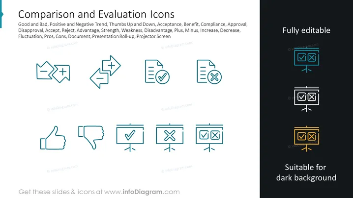
Die PowerPoint-Folie mit dem Titel "Vergleichs- und Bewertungs-Icons" präsentiert grafische Darstellungen von Konzepten wie gut und schlecht, Trends, Akzeptanz, Compliance und Bewertung. Die Folie zeigt Icons von Daumen hoch und runter, die Zustimmung und Ablehnung darstellen, Häkchen und Kreuze für Akzeptanz und Ablehnung, ein Plus- und Minuszeichen für Vor- und Nachteile sowie Dokumente mit Häkchen und Kreuzen, um bestätigte oder nicht bestätigte Elemente darzustellen. Die Icons zielen darauf ab, Schwankungen, Stärken, Schwächen, Vor- und Nachteile sowie relevante Konzepte in Dokumenten oder Präsentationen zu visualisieren.
Die Folie hat ein sauberes, modernes Design mit Icons, die in einem symmetrischen, gitterartigen Muster angeordnet sind. Das Farbschema ist einfach und stellt sicher, dass die Icons leicht unterscheidbar und in verschiedenen Präsentationskontexten anwendbar sind.



