Your graphics add a nice touch to my presentations and I recently used them for one of my all-hands meetings. Your toolbox adds professionalism to my slides. Instead of using standard clipart.
Claude Jones, Director of Engineer, @Walmartlabs, USA
Your graphics add a nice touch to my presentations and I recently used them for one of my all-hands meetings. Your toolbox adds professionalism to my slides. Instead of using standard clipart.
Claude Jones, Director of Engineer, @Walmartlabs, USA
I needed a fresh look at some of my slides. I've tried to find a way to create a paintbrush effect, to underline, accentuate, add some color and the handwritten markers were just the things. Very easy to use, easy to size, change the color. It was an affordable, perfect solution and I'm happy to recommend it.
Anonymous, US
The crisp, clean look of the graphics, and the fact that it allowed me to easily edit and change the colors to match the template was my main reason for purchasing them.
Brandie Jenkins, E-learning Developer, USA
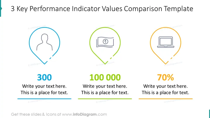
Die Folie präsentiert eine klare Vergleichsvorlage für drei Schlüssel-Leistungsindikatoren (KPIs). Jeder KPI ist in einer eigenen, farbigen Markierung wie eine Pinnadel eingefasst, die ein Icon enthält, das die Metrik darstellt—eine Benutzersilhouette, eine Geldnote und ein Laptop. Die Markierungen sind horizontal ausgerichtet und sind entsprechend nummeriert: "300," "100 000," und "70%". Unter jeder Zahl befindet sich ein begleitendes Textfeld für zusätzliche Erklärungen, das eine quantitative Messung und ihren Kontext oder ihre Bedeutung vorschlägt.
Die Folie hat ein modernes und professionelles Aussehen, nutzt eine einfache Farbpalette und klare Linien. Das Design ist minimalistisch, was hilft, den Fokus auf die Datenpunkte zu richten.


