Your graphics add a nice touch to my presentations and I recently used them for one of my all-hands meetings. Your toolbox adds professionalism to my slides. Instead of using standard clipart.
Claude Jones, Director of Engineer, @Walmartlabs, USA
Your graphics add a nice touch to my presentations and I recently used them for one of my all-hands meetings. Your toolbox adds professionalism to my slides. Instead of using standard clipart.
Claude Jones, Director of Engineer, @Walmartlabs, USA
I needed a fresh look at some of my slides. I've tried to find a way to create a paintbrush effect, to underline, accentuate, add some color and the handwritten markers were just the things. Very easy to use, easy to size, change the color. It was an affordable, perfect solution and I'm happy to recommend it.
Anonymous, US
The crisp, clean look of the graphics, and the fact that it allowed me to easily edit and change the colors to match the template was my main reason for purchasing them.
Brandie Jenkins, E-learning Developer, USA
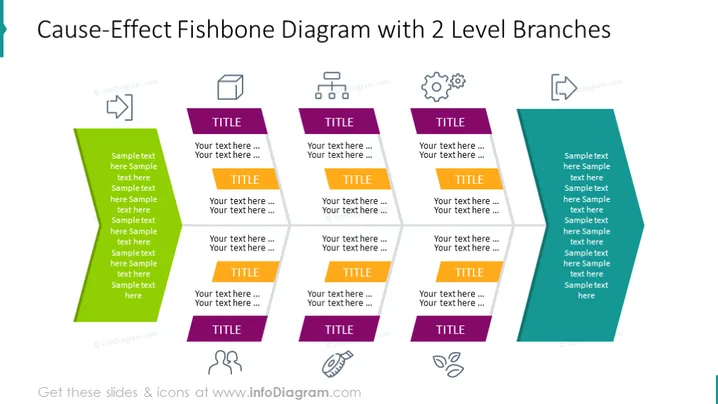
Die Folie zeigt ein Ursache-Wirkung Fischgrät-Diagramm mit zwei Ebenen von Zweigen. Jeder Zweig besteht aus einem großen farbigen Pfeil, der nach rechts zeigt und als Hauptkategorie dient, mit einem kleineren Pfeil darunter, der als Unterkategorie fungiert. Auf der Folie gibt es drei Sätze dieser Zweige, jeder in einer eigenen, markanten Farbe und mit passenden Symbolen. Diese Komponenten helfen offenbar, verschiedene Dimensionen oder Faktoren zu kategorisieren und zu erkunden, die zu einem zentralen Problem oder Effekt beitragen.
Das Gesamtbild der Folie ist sauber und professionell, wobei eine eingeschränkte Farbpalette verwendet wird, um die Kategorien klar zu unterscheiden. Die Symbole bieten einen visuellen Hinweis auf den Inhalt, und die Symmetrie der Folie macht sie ästhetisch ansprechend und leicht verständlich.


