Your graphics add a nice touch to my presentations and I recently used them for one of my all-hands meetings. Your toolbox adds professionalism to my slides. Instead of using standard clipart.
Claude Jones, Director of Engineer, @Walmartlabs, USA
Your graphics add a nice touch to my presentations and I recently used them for one of my all-hands meetings. Your toolbox adds professionalism to my slides. Instead of using standard clipart.
Claude Jones, Director of Engineer, @Walmartlabs, USA
I needed a fresh look at some of my slides. I've tried to find a way to create a paintbrush effect, to underline, accentuate, add some color and the handwritten markers were just the things. Very easy to use, easy to size, change the color. It was an affordable, perfect solution and I'm happy to recommend it.
Anonymous, US
The crisp, clean look of the graphics, and the fact that it allowed me to easily edit and change the colors to match the template was my main reason for purchasing them.
Brandie Jenkins, E-learning Developer, USA
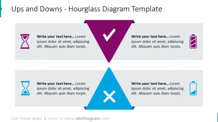
Die Folie bietet einen Rahmen zur Analyse kontrastierender Konzepte oder Zeitlinien mithilfe einer Sanduhrform als Metapher für den Übergang. Sie enthält zwei Sets von Sanduhr-Icons, die mit Textfeldern kombiniert sind. Die obere Hälfte hat eine lila Sanduhr mit einem Platzhalter-Textfeld, das die 'Höhen' oder positiven Aspekte signifiziert, während die untere Hälfte eine blaue Sanduhr mit dem entsprechenden Textfeld zeigt, die die 'Tiefen' oder negativen Aspekte darstellt. Dieses Layout lädt den Präsentierenden ein, Faktoren zu detaillieren, die zu Aufstieg und Fall in einem bestimmten Kontext beitragen.
Das Design der Folie ist minimalistisch, aber symbolisch, und nutzt die Sanduhr, um die Dualität von positiven und negativen Elementen darzustellen. Die Farbcodierung und die klare Unterteilung der Folie erhöhen deren visuelle Anziehungskraft und Interpretierbarkeit.


