
Your graphics add a nice touch to my presentations and I recently used them for one of my all-hands meetings. Your toolbox adds professionalism to my slides. Instead of using standard clipart.
Claude Jones, Director of Engineer, @Walmartlabs, USA
Your graphics add a nice touch to my presentations and I recently used them for one of my all-hands meetings. Your toolbox adds professionalism to my slides. Instead of using standard clipart.
Claude Jones, Director of Engineer, @Walmartlabs, USA
I needed a fresh look at some of my slides. I've tried to find a way to create a paintbrush effect, to underline, accentuate, add some color and the handwritten markers were just the things. Very easy to use, easy to size, change the color. It was an affordable, perfect solution and I'm happy to recommend it.
Anonymous, US
The crisp, clean look of the graphics, and the fact that it allowed me to easily edit and change the colors to match the template was my main reason for purchasing them.
Brandie Jenkins, E-learning Developer, USA
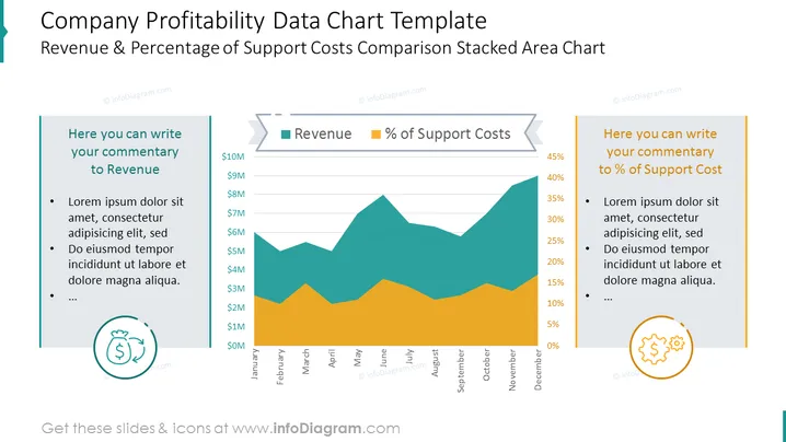
Dies ist ein Excel-gesteuertes PowerPoint-Layout, das ein gestapeltes Flächendiagramm präsentiert, das den Umsatz und den Prozentsatz der Supportkosten vergleicht, zusammen mit Kommentarsektionen für beide Faktoren. Es zeigt monatliche Geld- und Prozentwerte in einer klaren visuellen Darstellung gegeneinander.
Dieses Unternehmensprofitabilitätsdaten-Diagramm mit Werten und Beschreibungslayout ist Teil unserer PPT-Vorlage für Unternehmensfinanzdaten.




