Your graphics add a nice touch to my presentations and I recently used them for one of my all-hands meetings. Your toolbox adds professionalism to my slides. Instead of using standard clipart.
Claude Jones, Director of Engineer, @Walmartlabs, USA
Your graphics add a nice touch to my presentations and I recently used them for one of my all-hands meetings. Your toolbox adds professionalism to my slides. Instead of using standard clipart.
Claude Jones, Director of Engineer, @Walmartlabs, USA
I needed a fresh look at some of my slides. I've tried to find a way to create a paintbrush effect, to underline, accentuate, add some color and the handwritten markers were just the things. Very easy to use, easy to size, change the color. It was an affordable, perfect solution and I'm happy to recommend it.
Anonymous, US
The crisp, clean look of the graphics, and the fact that it allowed me to easily edit and change the colors to match the template was my main reason for purchasing them.
Brandie Jenkins, E-learning Developer, USA
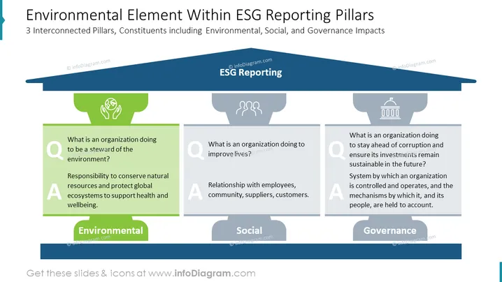
Dieses PowerPoint-Diagramm stellt 3 Elemente des ESG-Reporting in Form von Säulen dar, die das Gewölbe stützen. Die Säule, die das Umwelt-Thema repräsentiert, hebt sich durch die lebendige Farbe von den anderen – Sozial und Governance – ab. Sie ermöglicht es Ihnen, die häufigste Frage zur Nachhaltigkeit in Ihrem Bericht zu beantworten.
Dieser Umweltfaktor innerhalb des Diagramms der ESG-Berichtssäulen ist Teil unserer Umwelt-Nachhaltigkeitspolitik ESG-Bericht PPT-Vorlage.


