Your graphics add a nice touch to my presentations and I recently used them for one of my all-hands meetings. Your toolbox adds professionalism to my slides. Instead of using standard clipart.
Claude Jones, Director of Engineer, @Walmartlabs, USA
Your graphics add a nice touch to my presentations and I recently used them for one of my all-hands meetings. Your toolbox adds professionalism to my slides. Instead of using standard clipart.
Claude Jones, Director of Engineer, @Walmartlabs, USA
I needed a fresh look at some of my slides. I've tried to find a way to create a paintbrush effect, to underline, accentuate, add some color and the handwritten markers were just the things. Very easy to use, easy to size, change the color. It was an affordable, perfect solution and I'm happy to recommend it.
Anonymous, US
The crisp, clean look of the graphics, and the fact that it allowed me to easily edit and change the colors to match the template was my main reason for purchasing them.
Brandie Jenkins, E-learning Developer, USA
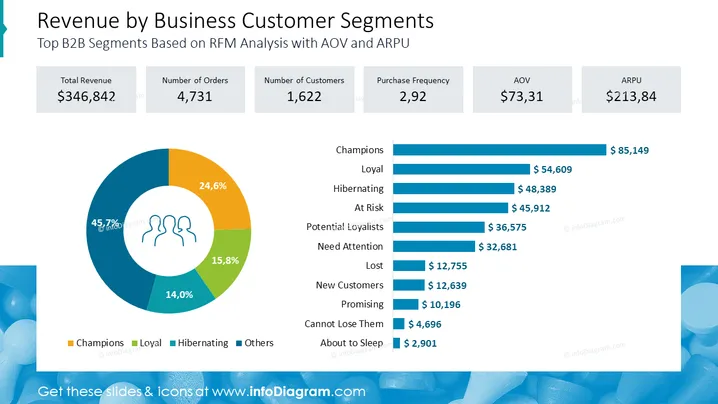
Die Folie präsentiert Daten zu "Top B2B-Segmente basierend auf RFM-Analyse mit AOV und ARPU." Wichtige Leistungskennzahlen wie Gesamteinnahmen (346.842 $), Anzahl der Bestellungen (4.731) und Anzahl der Kunden (1.622) werden neben Kaufhäufigkeit, AOV (durchschnittlicher Bestellwert, 73,31 $) und ARPU (durchschnittlicher Umsatz pro Nutzer, 213,84 $) angezeigt. Ein Kreisdiagramm kategorisiert Kundensegmente nach Prozentsatz, mit Bezeichnungen wie Champions (45,7 %), Loyal (24,6 %) und anderen. Ein vertikales Balkendiagramm zeigt monetäre Werte, die jedem Kundensegment zugeordnet sind und ihren Wert für das Unternehmen anzeigen.
Die Folie hat ein sauberes, professionelles Design mit einem farblichen Schema für Unternehmen. Die Diagramme bieten eine visuelle Darstellung der Daten, um die Beiträge und Leistungskennzahlen der Kundensegmente auf einen Blick einfach vergleichen zu können.


