Your graphics add a nice touch to my presentations and I recently used them for one of my all-hands meetings. Your toolbox adds professionalism to my slides. Instead of using standard clipart.
Claude Jones, Director of Engineer, @Walmartlabs, USA
Your graphics add a nice touch to my presentations and I recently used them for one of my all-hands meetings. Your toolbox adds professionalism to my slides. Instead of using standard clipart.
Claude Jones, Director of Engineer, @Walmartlabs, USA
I needed a fresh look at some of my slides. I've tried to find a way to create a paintbrush effect, to underline, accentuate, add some color and the handwritten markers were just the things. Very easy to use, easy to size, change the color. It was an affordable, perfect solution and I'm happy to recommend it.
Anonymous, US
The crisp, clean look of the graphics, and the fact that it allowed me to easily edit and change the colors to match the template was my main reason for purchasing them.
Brandie Jenkins, E-learning Developer, USA
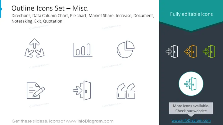
Diese PowerPoint-Folie präsentiert eine Sammlung von verschiedenen Umriss-Icons, einschließlich Symbolen für Richtungen, Daten-Säulendiagramm, Kreisdiagramm, Marktanteil, Zunahme, Dokument, Notizen, Ausgang und Zitat. Jedes Icon repräsentiert ein Konzept oder eine Aktion, die in verschiedenen Geschäftskontexten oder Präsentationen verwendet werden. Zum Beispiel kann das Richtungs-Icon mit zwei Pfeilen Entscheidungswege anzeigen, das Daten-Säulendiagramm symbolisiert Datenanalyse, und das Kreisdiagramm steht für Datensegmentierung oder Teile eines Ganzen. Die Icons für Marktanteil und Zunahme deuten wahrscheinlich auf finanzielle oder marktbezogene Wachstumskonzepte hin, während die Dokument- und Notiz-Icons mit der Aufzeichnung oder Informationsverarbeitung in Verbindung stehen könnten. Das Ausgangs-Icon wird typischerweise verwendet, um eine Methode des Ausgangs oder der Schließung zu kennzeichnen, und das Zitat-Icon kann sich auf die Zitation von Quellen oder das Hervorheben gesprochener Worte beziehen.
Die Folie hat ein sauberes und modernes Design, mit einem guten Gleichgewicht zwischen den Icons und dem Text. Der Farbkontrast zwischen den grauen und bunten Icons hebt effektiv die Bearbeitbarkeit der Icons hervor.


