
Your graphics add a nice touch to my presentations and I recently used them for one of my all-hands meetings. Your toolbox adds professionalism to my slides. Instead of using standard clipart.
Claude Jones, Director of Engineer, @Walmartlabs, USA

Your graphics add a nice touch to my presentations and I recently used them for one of my all-hands meetings. Your toolbox adds professionalism to my slides. Instead of using standard clipart.
Claude Jones, Director of Engineer, @Walmartlabs, USA
I needed a fresh look at some of my slides. I've tried to find a way to create a paintbrush effect, to underline, accentuate, add some color and the handwritten markers were just the things. Very easy to use, easy to size, change the color. It was an affordable, perfect solution and I'm happy to recommend it.
Anonymous, US
The crisp, clean look of the graphics, and the fact that it allowed me to easily edit and change the colors to match the template was my main reason for purchasing them.
Brandie Jenkins, E-learning Developer, USA
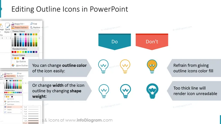
Die Folie gibt Anleitungen, wie man Umrissikonen in PowerPoint richtig bearbeitet. Sie legt nahe, dass die Änderung der Umrissfarbe einer Ikone unkompliziert ist, was bedeutet, dass es einfach ist, die Ikone an verschiedene Themen oder Vorlieben anzupassen. Es wird auch empfohlen, die Breite des Umrisses der Ikone anzupassen, indem das Gewicht der Form verändert wird, um eine gewünschte Dicke oder Betonung zu erreichen. Umgekehrt wird auf der Folie davon abgeraten, Umrissikonen mit Farbe zu füllen, da dies deren Klarheit beeinträchtigen kann, und es wird gewarnt, dass die Verwendung einer Linie, die zu dick ist, die Ikone unleserlich machen kann, was anzeigt, dass optimale Lesbarkeit ein ausgewogenes Liniengewicht erfordert.
Die Folie hat ein sauberes und organisiertes Layout mit einem starken Kontrast zwischen den empfohlenen Maßnahmen ('Do') und den zu vermeidenden Maßnahmen ('Don't'). Der Einsatz von einfachen Ikonen und Richtungssymbolen vermittelt die Designempfehlungen effektiv.