Your graphics add a nice touch to my presentations and I recently used them for one of my all-hands meetings. Your toolbox adds professionalism to my slides. Instead of using standard clipart.
Claude Jones, Director of Engineer, @Walmartlabs, USA
Your graphics add a nice touch to my presentations and I recently used them for one of my all-hands meetings. Your toolbox adds professionalism to my slides. Instead of using standard clipart.
Claude Jones, Director of Engineer, @Walmartlabs, USA
I needed a fresh look at some of my slides. I've tried to find a way to create a paintbrush effect, to underline, accentuate, add some color and the handwritten markers were just the things. Very easy to use, easy to size, change the color. It was an affordable, perfect solution and I'm happy to recommend it.
Anonymous, US
The crisp, clean look of the graphics, and the fact that it allowed me to easily edit and change the colors to match the template was my main reason for purchasing them.
Brandie Jenkins, E-learning Developer, USA
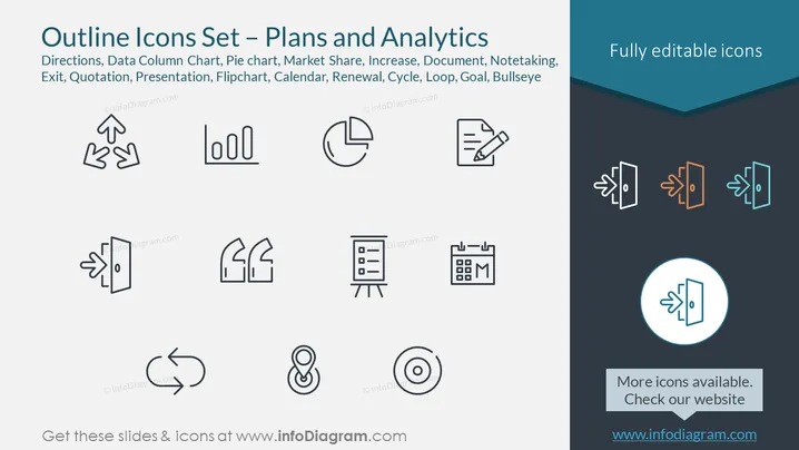
Die Folie präsentiert eine Sammlung von Umriss-Icons, die mit Geschäftsplänen und Analyse-Themen in Verbindung stehen, einschließlich Icons für Richtungen, Daten-Säulendiagramm, Kuchendiagramm, Marktanteil, Zunahme, Dokument, Notizen, Ausstieg, Zitat, Präsentation, Flipchart, Kalender, Erneuerung, Zyklus, Schleife, Ziel und Zielscheibe. Diese minimalistischen Symbole repräsentieren verschiedene Geschäftskonzepte: Richtungen symbolisieren Wahl oder Strategie, Daten-Säulendiagramm und Kuchendiagramm veranschaulichen Methoden zur Datenvisualisierung, Marktanteil und Zunahme weisen auf finanzielle Kennzahlen hin, Dokument und Notizen deuten auf Bürotätigkeiten hin, Ausstieg steht für betriebliche Beendigungen, Zitat für Kommunikation, Präsentation und Flipchart für Informationsweitergabe, Kalender für Terminplanung, Erneuerung für fortdauernde Vereinbarungen, Zyklus und Schleife für Prozesse, Ziel für Vorgaben, und Zielscheibe für Präzision oder Zielsetzung.
Die Folie bietet ein sehr einfaches und sauberes Design, das Klarheit und Benutzerfreundlichkeit priorisiert. Der Farbkontrast zwischen den Icons und dem Hintergrund sowie die Akzentfarbe im Kopfbereich lenken die Aufmerksamkeit auf die Schlüsselelemente der Folie.


