Your graphics add a nice touch to my presentations and I recently used them for one of my all-hands meetings. Your toolbox adds professionalism to my slides. Instead of using standard clipart.
Claude Jones, Director of Engineer, @Walmartlabs, USA
Your graphics add a nice touch to my presentations and I recently used them for one of my all-hands meetings. Your toolbox adds professionalism to my slides. Instead of using standard clipart.
Claude Jones, Director of Engineer, @Walmartlabs, USA
I needed a fresh look at some of my slides. I've tried to find a way to create a paintbrush effect, to underline, accentuate, add some color and the handwritten markers were just the things. Very easy to use, easy to size, change the color. It was an affordable, perfect solution and I'm happy to recommend it.
Anonymous, US
The crisp, clean look of the graphics, and the fact that it allowed me to easily edit and change the colors to match the template was my main reason for purchasing them.
Brandie Jenkins, E-learning Developer, USA
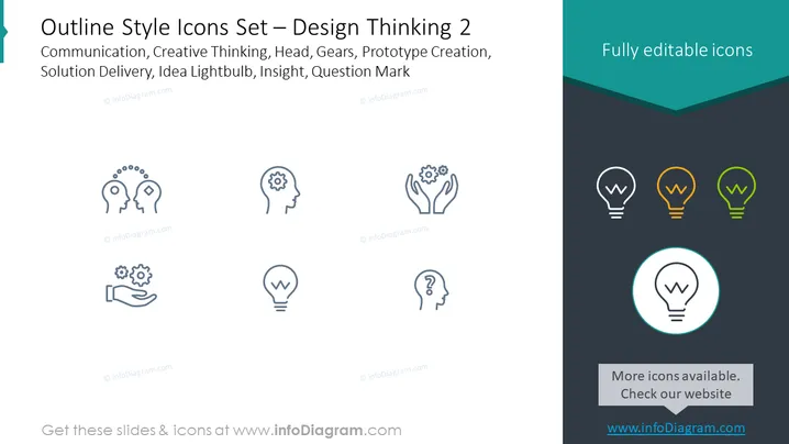
Die Folie trägt den Titel "Umriss-Stil-Icons Set – Design Thinking 2" und listet Konzepte wie Kommunikation, kreatives Denken, Kopf, Zahnräder, Prototypenerstellung, Lösungsbereitstellung, Ideen-Glühbirne, Einsicht und Fragezeichen. Jedes Konzept entspricht wahrscheinlich einem Symbol, das darauf ausgelegt ist, diese Ideen visuell darzustellen. Kommunikation könnte den Austausch von Ideen umfassen, kreatives Denken könnte mit Innovation zusammenhängen, der Kopf kann die Denkprozesse darstellen, Zahnräder könnten Mechanik oder Funktionsweise symbolisieren, Prototypenerstellung beinhaltet das Erstellen erster Modelle, Lösungsbereitstellung bezieht sich auf die Implementierung von Strategien, Ideen-Glühbirne deutet auf eine neue Idee hin, Einsicht steht für tiefes Verständnis, und Fragezeichen bedeutet Anfrage oder Unsicherheit.
Die grafische Darstellung der Folie präsentiert ein sauberes Design mit einem ausgewogenen Einsatz von Leerraum und Icon-Platzierung. Die kontrastierenden Hintergrundfarben schaffen eine visuelle Trennung, die hilft, die Icons hervorzuheben, während die umrissenen und teilweise gefüllten Icons einen Fortschritt oder eine Hierarchie implizieren.


