

Your graphics add a nice touch to my presentations and I recently used them for one of my all-hands meetings. Your toolbox adds professionalism to my slides. Instead of using standard clipart.
Claude Jones, Director of Engineer, @Walmartlabs, USA

Your graphics add a nice touch to my presentations and I recently used them for one of my all-hands meetings. Your toolbox adds professionalism to my slides. Instead of using standard clipart.
Claude Jones, Director of Engineer, @Walmartlabs, USA
I needed a fresh look at some of my slides. I've tried to find a way to create a paintbrush effect, to underline, accentuate, add some color and the handwritten markers were just the things. Very easy to use, easy to size, change the color. It was an affordable, perfect solution and I'm happy to recommend it.
Anonymous, US
The crisp, clean look of the graphics, and the fact that it allowed me to easily edit and change the colors to match the template was my main reason for purchasing them.
Brandie Jenkins, E-learning Developer, USA
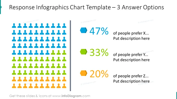
Diese PowerPoint-Folie zeigt eine grafische Darstellung von Umfrageergebnissen oder Präferenzen mit drei verschiedenen Kategorien, die als X, Y und Z bezeichnet sind. Es zeigt, dass 47% der Teilnehmer Option X bevorzugen, gefolgt von 33% für Option Y und 20% für Option Z. Jeder Prozentsatz wird durch eine andere Farbe und ein entsprechendes Symbol dargestellt, das potenziell die Anzahl der Personen anzeigen könnte, die diese Option bevorzugen. Die Folie scheint dazu zu dienen, die Beliebtheit oder Auswahlquote von drei verschiedenen Optionen visuell zu vergleichen.
Die Folie hat ein modernes, sauberes Design mit der Verwendung von flachen Symbolen und einer auffälligen Farbgebung für visuelle Segmentierung. Die Verwendung von Platzhaltern deutet darauf hin, dass die Folie anpassbar für verschiedene Datensätze und Beschreibungen ist.



