

Your graphics add a nice touch to my presentations and I recently used them for one of my all-hands meetings. Your toolbox adds professionalism to my slides. Instead of using standard clipart.
Claude Jones, Director of Engineer, @Walmartlabs, USA

Your graphics add a nice touch to my presentations and I recently used them for one of my all-hands meetings. Your toolbox adds professionalism to my slides. Instead of using standard clipart.
Claude Jones, Director of Engineer, @Walmartlabs, USA
I needed a fresh look at some of my slides. I've tried to find a way to create a paintbrush effect, to underline, accentuate, add some color and the handwritten markers were just the things. Very easy to use, easy to size, change the color. It was an affordable, perfect solution and I'm happy to recommend it.
Anonymous, US
The crisp, clean look of the graphics, and the fact that it allowed me to easily edit and change the colors to match the template was my main reason for purchasing them.
Brandie Jenkins, E-learning Developer, USA
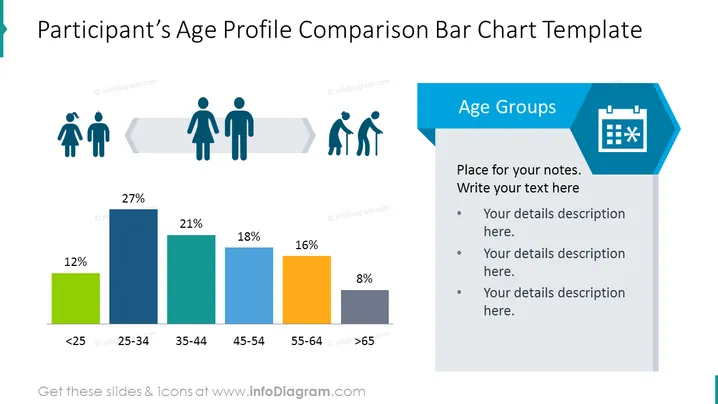
Die Folie präsentiert ein Balkendiagramm, das die Altersprofile der Teilnehmer vergleicht. Es gibt fünf Altersgruppen: "<25", "25-34", "35-44", "45-54" und ">65", die jeweils durch einen unterschiedlich gefärbten Balken und einen entsprechenden Prozentsatz dargestellt werden. Die jüngste Altersgruppe "<25" hat mit 12% den niedrigsten Prozentsatz, während "25-34" mit 27% den höchsten hat. Die Gruppen "35-44" und "55-64" sind mit 18% bzw. 16% ähnlich, während "45-54" bei 21% liegt und ">65" mit 8% der zweitniedrigste ist. Diese visuelle Darstellung ermöglicht einen einfachen Vergleich der Altersverteilung innerhalb einer Teilnehmergruppe.
Die Folie hat ein sauberes und professionelles Design mit einem gut organisierten Layout. Die Auswahl an Symbolen und die Farbcode helfen dabei, die Altersverteilung, die durch das Balkendiagramm dargestellt wird, schnell zu verstehen.



