

Your graphics add a nice touch to my presentations and I recently used them for one of my all-hands meetings. Your toolbox adds professionalism to my slides. Instead of using standard clipart.
Claude Jones, Director of Engineer, @Walmartlabs, USA

Your graphics add a nice touch to my presentations and I recently used them for one of my all-hands meetings. Your toolbox adds professionalism to my slides. Instead of using standard clipart.
Claude Jones, Director of Engineer, @Walmartlabs, USA
I needed a fresh look at some of my slides. I've tried to find a way to create a paintbrush effect, to underline, accentuate, add some color and the handwritten markers were just the things. Very easy to use, easy to size, change the color. It was an affordable, perfect solution and I'm happy to recommend it.
Anonymous, US
The crisp, clean look of the graphics, and the fact that it allowed me to easily edit and change the colors to match the template was my main reason for purchasing them.
Brandie Jenkins, E-learning Developer, USA
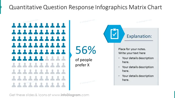
Die Folie ist so gestaltet, dass sie die Ergebnisse einer quantitativen Frage präsentiert, wobei speziell hervorgehoben wird, dass 56 % der Menschen Option X bevorzugen. Sie nutzt eine infografische Darstellung mit menschlichen Silhouetten, um die statistischen Daten visuell darzustellen, während ein Seitenfeld Platz für eine Erklärung oder detaillierte Anmerkungen bietet. Dies ermöglicht eine prägnante Zusammenfassung in Verbindung mit der Möglichkeit für tiefere Einblicke, ideal zur Übermittlung von Umfrageergebnissen oder demografischen Präferenzen.
Die Folie wird von Blau- und Grautönen dominiert, was eine professionelle und klare visuelle Gestaltung schafft. Der Einsatz von menschlichen Silhouetten fügt ein Element der Nachvollziehbarkeit hinzu, und die Trennung der Elemente ermöglicht ein einfaches Leseerlebnis.



