Your graphics add a nice touch to my presentations and I recently used them for one of my all-hands meetings. Your toolbox adds professionalism to my slides. Instead of using standard clipart.
Claude Jones, Director of Engineer, @Walmartlabs, USA
Your graphics add a nice touch to my presentations and I recently used them for one of my all-hands meetings. Your toolbox adds professionalism to my slides. Instead of using standard clipart.
Claude Jones, Director of Engineer, @Walmartlabs, USA
I needed a fresh look at some of my slides. I've tried to find a way to create a paintbrush effect, to underline, accentuate, add some color and the handwritten markers were just the things. Very easy to use, easy to size, change the color. It was an affordable, perfect solution and I'm happy to recommend it.
Anonymous, US
The crisp, clean look of the graphics, and the fact that it allowed me to easily edit and change the colors to match the template was my main reason for purchasing them.
Brandie Jenkins, E-learning Developer, USA
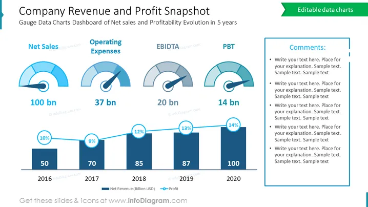
Die Folie ist ein finanzielles Dashboard, das einen Überblick über den Umsatz und die Gewinnentwicklung eines Unternehmens über fünf Jahre bietet. Sie umfasst Messinstrumente für Nettoumsatz, Betriebskosten (OPEX), EBITDA und Gewinn vor Steuern (PBT), mit entsprechenden Zahlen in Milliarden. Es gibt auch ein Balkendiagramm, das den Nettoumsatz und den Gewinnprozentsatz zeigt, der das Wachstum im Laufe der Zeit von 2016 bis 2020 darstellt. Diese visuelle Zusammenfassung ist darauf ausgelegt, einen klaren und präzisen Überblick über die finanzielle Gesundheit und die Entwicklung des Unternehmens zu bieten.
Insgesamt verwendet die Folie ein blau-weißes Farbschema, um eine saubere und professionelle Finanzpräsentation zu schaffen. Die Kombination aus Messinstrumenten und einem Balkendiagramm bietet ein schnelles, übersichtliches Verständnis des finanziellen Status des Unternehmens.
Diese Folie wäre geeignet für:


