

Your graphics add a nice touch to my presentations and I recently used them for one of my all-hands meetings. Your toolbox adds professionalism to my slides. Instead of using standard clipart.
Claude Jones, Director of Engineer, @Walmartlabs, USA

Your graphics add a nice touch to my presentations and I recently used them for one of my all-hands meetings. Your toolbox adds professionalism to my slides. Instead of using standard clipart.
Claude Jones, Director of Engineer, @Walmartlabs, USA
I needed a fresh look at some of my slides. I've tried to find a way to create a paintbrush effect, to underline, accentuate, add some color and the handwritten markers were just the things. Very easy to use, easy to size, change the color. It was an affordable, perfect solution and I'm happy to recommend it.
Anonymous, US
The crisp, clean look of the graphics, and the fact that it allowed me to easily edit and change the colors to match the template was my main reason for purchasing them.
Brandie Jenkins, E-learning Developer, USA
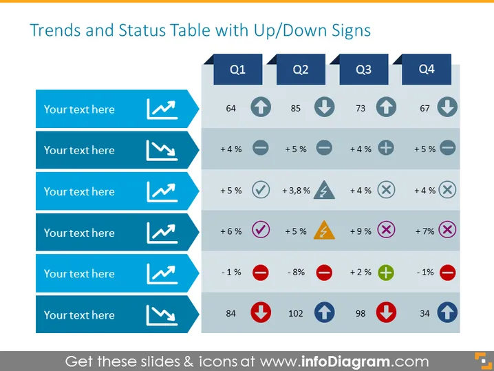
Die Folie mit dem Titel "Trends und Status-Tabelle mit Auf-/Ab-Zeichen" enthält Leistungsdaten über vier Quartale, Q1 bis Q4. Jede Quartalsspalte hat einen entsprechenden Auf- oder Abwärtspfeil, um einen Anstieg oder Fall der Werte anzuzeigen, was die Leistungstrends kennzeichnet. Unter jedem Quartal befinden sich sechs Zeilen, laminiert in Blau, wobei jede Zeile für das Einfügen beschreibender Texte bestimmt ist und mit bestimmten Leistungskennzahlen wie prozentualen Veränderungen oder Zahlenwerten verbunden ist. Leistungsindikatoren wie die prozentuale Veränderung weisen oft auf Wachstum oder Rückgang hin, was die Dynamik einer bestimmten Kennzahl im Laufe der Zeit betont.
Das Gesamterscheinungsbild der Folie ist klar und professionell, mit einem gut organisierten Layout, das Daten durch farbcodierte Symbole und Pfeile deutlich trennt und ein schnelles Verständnis von Trends und Status der präsentierten Kennzahlen erleichtert.



