

Your graphics add a nice touch to my presentations and I recently used them for one of my all-hands meetings. Your toolbox adds professionalism to my slides. Instead of using standard clipart.
Claude Jones, Director of Engineer, @Walmartlabs, USA

Your graphics add a nice touch to my presentations and I recently used them for one of my all-hands meetings. Your toolbox adds professionalism to my slides. Instead of using standard clipart.
Claude Jones, Director of Engineer, @Walmartlabs, USA
I needed a fresh look at some of my slides. I've tried to find a way to create a paintbrush effect, to underline, accentuate, add some color and the handwritten markers were just the things. Very easy to use, easy to size, change the color. It was an affordable, perfect solution and I'm happy to recommend it.
Anonymous, US
The crisp, clean look of the graphics, and the fact that it allowed me to easily edit and change the colors to match the template was my main reason for purchasing them.
Brandie Jenkins, E-learning Developer, USA
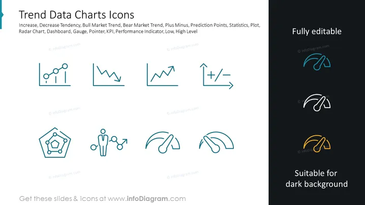
Die Folie mit dem Titel "Trenddaten Diagramm-Icons" präsentiert eine Reihe von bildlichen Symbolen, die mit Datentrends und -analysen in Verbindung stehen, einschließlich einer Tendenz zu steigendem und fallendem Verlauf, Bullen- und Bärenmarkttrends, statistischen Plus- und Minuswerten, Vorhersagepunkten und verschiedenen Messinstrumenten wie Radardiagrammen, Dashboards, Messgeräten und Indikatoren. Das Konzept der KPI (Key Performance Indicator) wird ebenfalls dargestellt, zusammen mit Indikatoren für niedrige und hohe Werte, die visuelle Hinweise für Präsentationen bieten, die sich mit Leistungsüberwachung und Datenvisualisierung im geschäftlichen Kontext befassen. Jedes Symbol ist eine einfache visuelle Metapher für das jeweilige Datenkonzept, das es darstellt.



