Your graphics add a nice touch to my presentations and I recently used them for one of my all-hands meetings. Your toolbox adds professionalism to my slides. Instead of using standard clipart.
Claude Jones, Director of Engineer, @Walmartlabs, USA
Your graphics add a nice touch to my presentations and I recently used them for one of my all-hands meetings. Your toolbox adds professionalism to my slides. Instead of using standard clipart.
Claude Jones, Director of Engineer, @Walmartlabs, USA
I needed a fresh look at some of my slides. I've tried to find a way to create a paintbrush effect, to underline, accentuate, add some color and the handwritten markers were just the things. Very easy to use, easy to size, change the color. It was an affordable, perfect solution and I'm happy to recommend it.
Anonymous, US
The crisp, clean look of the graphics, and the fact that it allowed me to easily edit and change the colors to match the template was my main reason for purchasing them.
Brandie Jenkins, E-learning Developer, USA
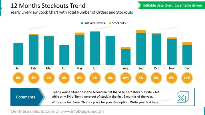
Die PowerPoint-Folie zeigt einen "12 Monate Ausverkaufs-Trend" und hebt ein Jahresüberblicks-Diagramm mit der Gesamtzahl der Bestellungen und Ausverkäufen hervor. Das Balkendiagramm vergleicht erfüllte Bestellungen (in Türkis) mit Ausverkäufen (in Orange) über das Jahr, von Januar bis Dezember. Prozentsätze unter jedem Monat geben die Ausverkaufsquote an und informieren visuell über die Effektivität des Bestandsmanagements. Ein Abschnitt "Kommentare" in der unteren linken Ecke weist auf eine deutliche Verschlechterung in der zweiten Jahreshälfte basierend auf diesen Raten hin, mit einem Aufruf zur genaueren Überprüfung der Daten oder zur Hinzufügung von mehr Kontext.
Das allgemeine Erscheinungsbild der Folie ist sauber und geschäftlich, wobei ein farbkodiertes Balkendiagramm für eine einfache Interpretation der Daten verwendet wird. Es ermöglicht ein schnelles Verständnis des Trends und der Probleme mit Beständen im Verlauf eines Jahres.


