Your graphics add a nice touch to my presentations and I recently used them for one of my all-hands meetings. Your toolbox adds professionalism to my slides. Instead of using standard clipart.
Claude Jones, Director of Engineer, @Walmartlabs, USA
Your graphics add a nice touch to my presentations and I recently used them for one of my all-hands meetings. Your toolbox adds professionalism to my slides. Instead of using standard clipart.
Claude Jones, Director of Engineer, @Walmartlabs, USA
I needed a fresh look at some of my slides. I've tried to find a way to create a paintbrush effect, to underline, accentuate, add some color and the handwritten markers were just the things. Very easy to use, easy to size, change the color. It was an affordable, perfect solution and I'm happy to recommend it.
Anonymous, US
The crisp, clean look of the graphics, and the fact that it allowed me to easily edit and change the colors to match the template was my main reason for purchasing them.
Brandie Jenkins, E-learning Developer, USA
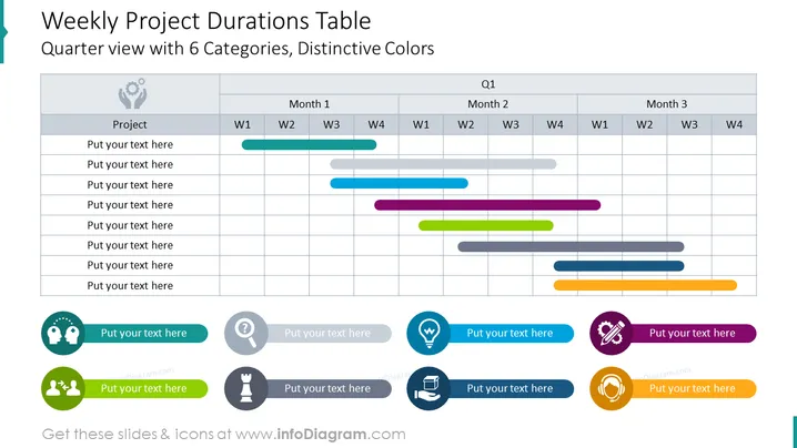
Diese PowerPoint-Folie mit dem Titel "Wöchentliche Projektdauer Tabelle" bietet eine vierteljährliche Ansicht mit 6 Kategorien in unterschiedlichen Farben. Die Tabelle ist in Spalten für die Wochen 1 bis 4 über drei Monate hinweg organisiert, was ein Quartal darstellt. Jede Zeile repräsentiert vermutlich ein anderes Projekt oder eine Aufgabe, die farblich kodiert ist, um die Dauer und den Zeitraum darzustellen. Die Farben helfen, zwischen den Aufgaben zu unterscheiden und sie den jeweiligen Wochen der Monate zuzuordnen, was eine visuelle Darstellung von überlappenden Aktivitäten und der Arbeitslastverteilung ermöglicht.


