Your graphics add a nice touch to my presentations and I recently used them for one of my all-hands meetings. Your toolbox adds professionalism to my slides. Instead of using standard clipart.
Claude Jones, Director of Engineer, @Walmartlabs, USA
Your graphics add a nice touch to my presentations and I recently used them for one of my all-hands meetings. Your toolbox adds professionalism to my slides. Instead of using standard clipart.
Claude Jones, Director of Engineer, @Walmartlabs, USA
I needed a fresh look at some of my slides. I've tried to find a way to create a paintbrush effect, to underline, accentuate, add some color and the handwritten markers were just the things. Very easy to use, easy to size, change the color. It was an affordable, perfect solution and I'm happy to recommend it.
Anonymous, US
The crisp, clean look of the graphics, and the fact that it allowed me to easily edit and change the colors to match the template was my main reason for purchasing them.
Brandie Jenkins, E-learning Developer, USA
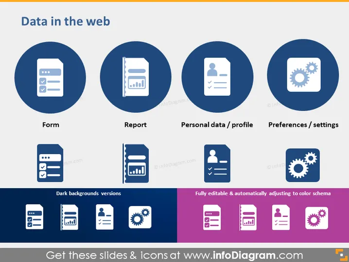
Die Folie präsentiert verschiedene Aspekte der Benutzerinteraktion mit Daten im Web, die jeweils durch ein Symbol innerhalb eines kreisförmigen Rahmens dargestellt werden. "Formular" deutet auf Dateneingabe- oder Übermittlungsoberflächen hin, wie zum Beispiel Kontaktformulare auf Websites. "Bericht" vermittelt die Erstellung oder den Empfang von strukturierten Daten, wie Analysen oder Zusammenfassungen. "Personenbezogene Daten / Profil" befasst sich mit benutzerspezifischen Informationen, die auf Plattformen gespeichert sind, und spiegelt Kontodetails oder Identitätsinformationen wider. "Präferenzen / Einstellungen" weist auf anpassbare Benutzeroptionen innerhalb von Anwendungen oder Diensten hin und hebt Personalisierung und Konfiguration hervor.
Die gesamte Folie hat ein klares, modernes Layout mit einem guten Einsatz von Symbolen, um die Kernkonzepte visuell darzustellen. Das Farbschema ist konsistent und verwendet Schattierungen von Blau und Lila, die angenehm für die Augen sind.


