

Your graphics add a nice touch to my presentations and I recently used them for one of my all-hands meetings. Your toolbox adds professionalism to my slides. Instead of using standard clipart.
Claude Jones, Director of Engineer, @Walmartlabs, USA

Your graphics add a nice touch to my presentations and I recently used them for one of my all-hands meetings. Your toolbox adds professionalism to my slides. Instead of using standard clipart.
Claude Jones, Director of Engineer, @Walmartlabs, USA
I needed a fresh look at some of my slides. I've tried to find a way to create a paintbrush effect, to underline, accentuate, add some color and the handwritten markers were just the things. Very easy to use, easy to size, change the color. It was an affordable, perfect solution and I'm happy to recommend it.
Anonymous, US
The crisp, clean look of the graphics, and the fact that it allowed me to easily edit and change the colors to match the template was my main reason for purchasing them.
Brandie Jenkins, E-learning Developer, USA
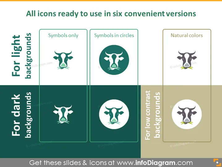
Die PowerPoint-Folie präsentiert sechs Versionen eines Icons, das für verschiedene Hintergründe entworfen wurde. "Nur Symbole" zeigt das Icon ohne zusätzliche Verzierung. "Symbole in Kreisen" platziert das Icon innerhalb eines kreisförmigen Rahmens, was ein definierteres und eingekapseltes Erscheinungsbild suggeriert. "Natürliche Farben" bezieht sich auf das Icon, das in mehreren Farbtönen dargestellt wird, um ein realistisches oder visuell reichhaltiges Aussehen zu vermitteln. Icons auf hellen Hintergründen sollen auf helleren Folien hervorstechen, während solche für dunkle Hintergründe die Sichtbarkeit gegen tiefere Farbtöne sicherstellen. Für Hintergründe mit geringem Kontrast sind die Icons mit ausreichender Differenzierung gestaltet, um unterscheidbar zu bleiben.



