Your graphics add a nice touch to my presentations and I recently used them for one of my all-hands meetings. Your toolbox adds professionalism to my slides. Instead of using standard clipart.
Claude Jones, Director of Engineer, @Walmartlabs, USA
Your graphics add a nice touch to my presentations and I recently used them for one of my all-hands meetings. Your toolbox adds professionalism to my slides. Instead of using standard clipart.
Claude Jones, Director of Engineer, @Walmartlabs, USA
I needed a fresh look at some of my slides. I've tried to find a way to create a paintbrush effect, to underline, accentuate, add some color and the handwritten markers were just the things. Very easy to use, easy to size, change the color. It was an affordable, perfect solution and I'm happy to recommend it.
Anonymous, US
The crisp, clean look of the graphics, and the fact that it allowed me to easily edit and change the colors to match the template was my main reason for purchasing them.
Brandie Jenkins, E-learning Developer, USA
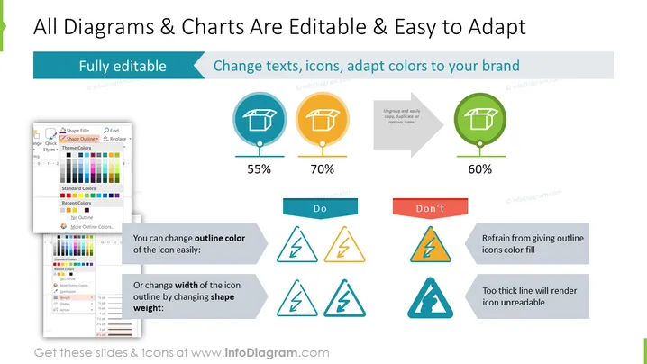
Diese PowerPoint-Folie präsentiert die Anpassungsoptionen für Diagramme und Charts und hebt ihre bearbeitbare Natur sowie die Flexibilität zur Anpassung an die visuelle Identität einer Marke hervor. Sie zeigt Beispiele dafür, wie man die Farben der Umrisslinien und die Gewichtungen der Formen ändert und veranschaulicht gute und schlechte Praktiken mit prozentualen Bewertungen, die die Effektivität jedes Ansatzes anzeigen. Zu den wichtigsten umsetzbaren Punkten gehören die Möglichkeit zur vollständigen Anpassung, das Ändern von Texten, das Anpassen von Icons und das Anpassen an Markenfarben. Die Folie listet wesentliche Dos und Don'ts auf: Machen Sie die Umrissfarbe und die Formgewichtung, aber geben Sie den Umriss-Icons keine Farbausfüllung oder verwenden Sie nicht übermäßig dicke Linien, da diese die Lesbarkeit verringern.


