Your graphics add a nice touch to my presentations and I recently used them for one of my all-hands meetings. Your toolbox adds professionalism to my slides. Instead of using standard clipart.
Claude Jones, Director of Engineer, @Walmartlabs, USA
Your graphics add a nice touch to my presentations and I recently used them for one of my all-hands meetings. Your toolbox adds professionalism to my slides. Instead of using standard clipart.
Claude Jones, Director of Engineer, @Walmartlabs, USA
I needed a fresh look at some of my slides. I've tried to find a way to create a paintbrush effect, to underline, accentuate, add some color and the handwritten markers were just the things. Very easy to use, easy to size, change the color. It was an affordable, perfect solution and I'm happy to recommend it.
Anonymous, US
The crisp, clean look of the graphics, and the fact that it allowed me to easily edit and change the colors to match the template was my main reason for purchasing them.
Brandie Jenkins, E-learning Developer, USA
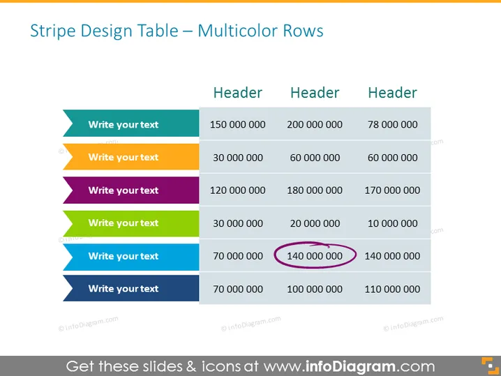
Die Folie präsentiert eine Tabelle mit mehrfarbigen Zeilen, die anscheinend angeordnet sind, um einen Vergleich oder eine Kategorisierung über verschiedene Kennzahlen zu zeigen. Es gibt Platzhaltertexte in farbenfrohen Tabellenzeilenüberschriften, die Bereiche für Benutzernanpassungen vorschlagen: "Schreiben Sie Ihren Text." Die Spalten tragen die generische Überschrift "Überschrift" mit numerischen Daten darunter, was auf quantitative Vergleichspunkte oder Leistungskennzahlen hinweist.
Das Gesamterscheinungsbild der Folie ist hell und organisiert, mit einem strukturierten Layout, das den einfachen Vergleich von Informationen über verschiedene Kategorien hinweg erleichtert. Der Einsatz von Farben hilft dabei, verschiedene Abschnitte zu unterscheiden und lenkt effektiv die Aufmerksamkeit auf die Daten.


